Skip to content
The Marsid M&M Group Blog

The Marsid M&M Group Blog

Printing and Design Blog

  • MMPrint.com
  • Printing News
    A collection of useful printing resources to inspire a smarter printing customer and graphic designer.
  • Design Tutorials
    A collection of design resources to help create useful design and encourage the use of design principles
  • Marketing Tips
    Business Marketing Tips and Tools to Increase your Marketing Productivity and Success.
  • Direct Mail
    The 5 W’s of Mailing and Fulfillment. What, Where, When, Why and Who!
  • Freebies
    A collection of curated quality links and downloads to useful free for commercial use graphics, fonts and much more.

Categories

  • Color Tips
  • Courses
  • Designer Tutorials
  • Development
  • Freebies
  • Learning
  • Mailing & Fulfillment
  • Managing
  • Marketing Tips
  • Printing News
  • Typography

Tags

  • advertising
  • brand
  • brand identity
  • Branding
  • brochure
  • business card
  • Catalog Printing
  • CMYK
  • color
  • custom
  • custom die cut
  • design
  • design inspiration
  • die cut
  • direct mail
  • eddm
  • envato
  • foil stamping
  • fonts
  • Illustrator
  • InDesign
  • large format
  • letterhead
  • logo
  • Logo Design
  • mailing
  • marketing
  • pantone
  • Pantone Matching System
  • Photoshop
  • PMS
  • poster
  • poster design
  • printing
  • product marketing
  • QR
  • QR Code
  • service advertising
  • simple
  • small business
  • smart phone
  • typography
  • USPS
  • Variable Data
  • Vector

Tag: logo

Beef Up Your Business Cards With These Plug-ins

Beef Up Your Business Cards With These Plug-ins

Standard business cards are typically rectangular, 2 x 3.5 inches on white stock. The only thing that differentiates them from other business cards is the information and graphics. Adding custom finishes to your business cards bring them to life. The combinations are endless, but by using just one finishing option your business cards will be “Slicker than a harpooned hippo on a banana tree” (not entirely sure what that means but it seems to get the point across that your business cards will stand out!).

These Cards Mean Business


Embossing

Embossing your business cards is just awesome. This method has many variations from blind embossing to  multi-level embossing to embossing with foil stamping. It gives your business card dimension, it makes you want to look at it from different angles. But best of all, if used correctly, it’s classy.
Embossing of Business Cards

Foil Stamping

Foil Stamping enhances your business cards by reflecting light in the area where it is foil stamped. This reflection attracts the eye of the viewer. Foil is available in many metallic colors and even holographic patterns…if you want your business card to pop, this is the way to go! Foil Stamped Business Cards

Spot UV Coating

Spot UV coating creates a reflective mirror-like sheen only in areas where it is designated, hence the name “Spot” UV. By using a spot UV layer on your business card, you can intensify the visibility of a certain graphic or even create a graphic out of the spot UV itself on a solid background. The example above have the 7 A.M. logo using this method so that the logo is only visible when angled to a light source. Very creative! Spot UV Coating Business Cards

Custom Die Cut

Custom die cut business cards are the epitome of customization! The shape of your business card can be made to just about anything. Match the shape of your logo or product or you can add special folds to really make your business cards unique. Give them something they will never forget! Die Cut Business Cards

Pantone (PMS) Colors

If branding is important to your company, making sure your brand is recognizable and memorable can be as easy as selecting a specific Pantone color for consistency This color is used throughout all of your marketing collateral and anywhere your logo/brand is displayed. Many (if not all) of the major brands do this. One of the most used examples is Coca-cola’s red. Pantone PMS Business Cards


A Custom Combination of Finishes

The more of these finishes you use on your business cards, the more they will stand out in a stack. I don’t think there’s any way of overdoing it. When used correctly your business cards will serve as a sales tool and conversational piece that can get the ball rolling on a new sale. Use them to feature a new product or to show prestige that reflects on your business. The variations and possibilities are endless. Business Cards with a Combination of Finishes

Posted on January 24, 2013January 24, 2013Author GiovanniCategories Color Tips, Marketing Tips, Printing NewsTags brand, Branding, business card, business cards, custom, custom die cut, design, Embossing, foil stamping, logo, marketing, pantone, Pantone Matching System, PMS, printing1 Comment on Beef Up Your Business Cards With These Plug-ins
Creating Die Lines for Custom Die Cut Printing in Adobe Illustrator

Creating Die Lines for Custom Die Cut Printing in Adobe Illustrator


This post is best suited for graphic designers who will be working on a die cutting project and/or those of you who simply like to know how to do stuff.

Creating a die line for die cutting can be pretty simple or can be quite difficult, all depends on your design and some planning beforehand can come in very handy later on.

First, I want to make it clear that die cutting thin lines is not always a good idea. Thin lines in a die create thin cuts in the paper that can easily bend or rip off. Sometimes it’s unavoidable such as die cutting hair or thin fonts but if possible, always try to use thick locks of hair or bold type if your die cut is typography-based.

Custom Die Cut Hang Tags

For this tutorial we are going to create a Die Cut Hang Tag. Many clothing manufacturers use hang tags to brand their merchandise and sometimes include information about the product or the company on the back or inside if it is a folding hang tag.


For this tutorial, we will use a fictitious Clothing Brand called mmprint.

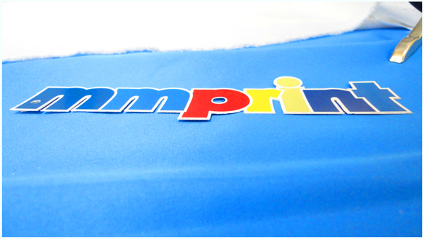
mmprint HangTag Logo


Our goal is to have a finished hang tag where we will die cut the mmprint with the white Stroke around it. Leaving the grey area (which for purposes of this tutorial is simulating the paper) by using a die cutter such as our Heidelberg Windmill Letterpress.


The Right Tools

The die line must be made using a vector design program such as Adobe Illustrator or InDesign. A die maker uses a CNC (Computer Numerical Control) machine which uses CAD software to send the design commands to the CNC machine.

vector vs raster
Since the CNC is computer controlled, it requires vector lines to operate. Raster lines are created using blocks which then create jagged edges along the perimeter of the line.


Preparing the Artwork

Creating the die line for the mmprint hang tag should be rather straight forward and simple. We used Century Gothic Bold for the text and made an offset path to make it thicker, then added a 3pt. Stroke around it. All we really need to do is make a line that goes around the entire perimeter of the white Stroke.

Sure, you can show off your Pen tool skills and trace the whole thing but working efficiently is key for a designer and when you have other projects to move on to, time is important.

At this point in our design, our stroke is an effect applied to the object. When you select the object with the black arrow, you will see that the selection line is located within the stroke. Since we need the die line to be the outside edge of the stroke, we have to make the stroke an object itself.

  • Select the mmprint object then click Edit>Copy then click Edit>Paste in Front

  • With the new object selected, click Object>Expand

  • While still selected, click the Unite button in the PathFinder tab (Window>Pathfinder)
Now you should have the outline of the object that is completely white, which notably is the shape that will remain in the sheet of paper once the mmprint is die cut out…
mmprint Die Cut Out

Now just 2 more steps.


  • While our new white object selected, all we need to do is give it a 1pt. stroke (I chose orange so it stands out) and remove the fill color.


Here is the result:

Die Cut Line
The orange line is the area where the die cut will be made

Cleaning Up

The final step is to convert the orange color we selected into a PMS color that we will call “Die Line”.
The purpose of making the die line its own PMS color is so that it separates correctly when making plates. The CMYK parts separate accordingly for printing and our “Die Line” PMS will separate as one separate plate for the die.
Here is how it’s done:
Adobe Illustrator Swatches Panel
With the Die Line Layer selected, Double click the Orange color in your Swatches Panel.
Adobe Illustrator Swatch Options Panel
Change the Swatch Name to “Die Line”, change Type to “Spot Color” and click OK


Adobe Illustrator Swatches Panel PMS
Notice the Orange color swatch has a White corner with a Black dot in it…this means it has been converted to a PMS color


Tips and Tricks

It’s always a good idea to consult with the printer/die cutter before you spend a lot of time on your design. Discuss and if possible, show a sketch or basic artwork of your die cut to get feedback on what may or may not work.

As a graphic designer/consultant, you are hired to be efficient and work within budgets.

To save on die charges, you can always use a pre-made Die Cut shapes and customize only the printing.

We offer a nice selection of pre-made die cut shapes:


Custom Die Cut Shapes


Take the Design Even Further

When budget is not an obstacle, take your creativity to the next level with Foil Stamping and Embossing.

At this point you can design a hang tag with all the bells and whistles that people may possibly keep. Hang tags create an amazing opportunity to spread your branding with the very merchandise that you sell. Make your hang tag reflect the quality of your company and your product.

So how do you prepare the design for foil stamping and embossing?

Sign Up for our RSS Feed, Follow us on Twitter and Like Us on Facebook to be alerted when the foil stamping tutorial is published.


mmprint Hang Tag

Posted on March 20, 2012January 19, 2018Author GiovanniCategories Designer Tutorials, TypographyTags advertising, brand, brand identity, Branding, CMYK, color, custom, custom die cut, design inspiration, die cut, die line, foil stamping, Illustrator, logo, Logo Design, marketing, Pantone Matching System, PMS, printing, product marketing, typography, Vector5 Comments on Creating Die Lines for Custom Die Cut Printing in Adobe Illustrator
Complementing Innovation: Taking a Step Back to Take a Step Forward

Complementing Innovation: Taking a Step Back to Take a Step Forward


These days it’s hard to keep up with the advancement of technology, whether in our personal lives or in business. Seems that before we even become accustomed to a new product or system there is another that replaces it.

At The Marsid-M&M Group we are always trying to stay on the cutting edge of technology, but recently we decided to take a different approach…

We decided that in order to move forward we had to take a step back in time, to our roots one might say.

-Barry Caputo, Co-owner

The evolution of print has brought upon us a new age where digital printing, short runs and variable data have become a large part of our everyday business. We realized that these customers were in need of more finishing options than we previously offered while keeping costs down and still manage to deliver a quality product.

So we hired Heidi and gave her an office:

Original Heidelberg Windmill Press
Heidi is a Heidelberg Windmill Letterpress. She's hardworking, precise and classy; she's tough. Been around the block, but still in great shape. Our BizHub Digital Presses say she's quite the cougar.


Heidi Finds a New Home


The Heidelberg Windmill Letterpress made it’s first public appearance in 1913.

The beauty before you in the image above was manufactured in August of 1969. She had lived in San Diego, California for many years where she printed all types of advertisements, brochures and stationery.   She was one of 10 Heidelberg Windmill Letterpresses which were all lined up in a row.  She worked very hard for 10 hours every day and 10 hours every night with very little rest; as did her 9 sisters sitting beside her on the long and narrow concrete floor that she called home.

Right after her 15th birthday in September of 1984, the factory that Heidi worked in was shut down.  People said, “It was because there were newer types of printing presses called Offset Machines that could run faster and produce better and cleaner printed work.”  Heidi then sat idle on that cold concrete floor with no electricity or oil for almost two years… Read the full story written by very proud owner, Sid Halpern.

A Windmill of Opportunity


Die Cutting and Foil Stamping are only a few of Heidi’s traits. With a few add-ons she can also print color, emboss, score, perforate and number.

At this time we use her for Die Cutting, Foil Stamping and Scoring:

Card Stock Scoring
Card Stock Scoring
Custom Die cut Desk Calendar
Custom Die Cutting
Custom Foil Stamping
Custom Foil Stamping / Die Cut


Vision Becomes Reality


Our goal was to offer more custom finishing options to our customers with low minimums and make it available for digitally printed materials. We also envisioned a whole new line of products that we could offer in addition to our standard printed materials.

Well, we’re the type of company that doesn’t let good ideas go by the wayside so we went gung-ho, full speed ahead and there was no stopping us.

Over the next few months we will be adding a slew of new products to our website that provide a foundation for your own new ideas that are only limited by creativity.


The Benefit is Clear: Stand Out from the Rest


Custom Die Cut Business CardsDie Cut Business Cards

We all know in business it’s very important to make a great first impression. Most first business meetings begin with a handshake and an exchange of business cards.

A well crafted business card is as firm a statement as is a firm handshake.

We currently offer these standard die-cut business cards that you can pick from and you can always request a quote for custom die cutting to your specific shape:


Custom Die Cut Shapes

Feel free to download our Die Cut Business Card Templates.


Die Cut Desk Calendar


Die Cut Desk Calendars

Calendars offer 365 days of steady promotion and you only pay for them once!

Standard calendars are made to be hung on a wall but Die Cut Desk Calendars are made to stand on a desk which makes them more accessible.

Your company name and contact information will be displayed at all times at arm’s length.


Custom Die Cut Hang Tag


Die Cut HangTags

Boost the value of your product with custom Die Cut Hang Tags. A great way to include your branding and a description of the product or instructions on how to use it.

Many standard shapes are available or you can always go a little further and customize the shape for a truly unique finish!


Custom Die Cut Shapes

Feel free to download our Die Cut Hang Tag Templates.


Die Cut Bookmarks


Die Cut Bookmarks

Still a very popular product, die cut bookmarks make effective and simple promo products that everyone likes. Add a custom shape and a tassel to make it even more attractive.

Lamination, UV coating, Aqueous coating also available.


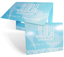
Die Cut Gift Card Holders


Die Cut Gift Card Holders

Retail establishments can really benefit from our custom printed die cut gift card holders. Make your gift cards more presentable by providing a safe and secure holder that can be customized with your artwork.

Great for branding and promotions.


What Die Cut products would you like to recommend we offer in the future?

Posted on February 24, 2012February 28, 2012Author GiovanniCategories Printing NewsTags Branding, business card, calendar, custom, custom die cut, desk calendar, Evolution of Print, foil stamping, Gift Card Holder, hang tags, Heidelberg, logo, marketing, PMS, printing, product marketing2 Comments on Complementing Innovation: Taking a Step Back to Take a Step Forward
Typography: Kerning, Leading and Tracking

Typography: Kerning, Leading and Tracking

Typography Kerning and Leading Banner

Kerning and Leading are ways to manipulate the spacing between characters. Spatial manipulation in type can be a very important tool. Some fonts need to have individual characters adjusted to help create better readability and a more aesthetically pleasing layout. Changes to kerning and leading often go unnoticed, but in most situations that is what the designer will only want a subtle change that fixes readability.

Leading is the Space Between Baselines


Leading

Leading is the spacing between the baselines of type. The term leading is derived from the practice of placing lead strips between lines type on older hand set printing presses such as a letterpress.  Adjusting the leading is also a very useful way of saving or using space on a page. Leading can also be used to change the aesthetics when dealing with a typographical design.

Kerning

Kerning is the spacing in between individual characters. Most fonts will have specific default kerning for individual character sets so that the spacing in between the letters in words feels more natural. The image below has a sentence with and without custom kerning applied in 5 different spots to show how subtle the change is.  Most of the time, people will not realize that kerning was included to change the type of the design.

Kerning Spacing between Characters of Type

Tracking

Another adjustment to type that hasn’t been mentioned is Tracking.  Tracking is very similar to kerning in that it is the spacing between individual characters, but tracking is the space between groups of letters rather than individual letters.  Tracking affects the overall character density of the copy. Other than the actual effect that it could have on readability of type, tracking would be used to make lines of type even.  Tracking will help to eliminate widows and orphans in paragraphs.  Widows are when the final line of a paragraph begins a new column or page.  Orphans are when paragraphs end in single words, part of words or a short phrase that seems out of place.

Kerning and Leading are important in typography and should not be ignored. It is the finishing touch on the type that makes everything read and flow properly. The design is not really complete until kerning and leading have been considered, but that doesn’t mean that they are always necessary. It shouldn’t be forced upon a design, but it should look natural.

Which do you find yourself adjusting the most when creating typography – Kerning, Leading, Tracking or all of them?

Posted on August 1, 2011January 19, 2018Author GiovanniCategories Designer Tutorials, TypographyTags design, design inspiration, Illustrator, InDesign, kerning, Leading, logo, Logo Design, marketing, Pantone Matching System, Photoshop, printing, tracking, Typeface, typography, Vector6 Comments on Typography: Kerning, Leading and Tracking
How to Find Vector Corporate Logos and Hi-Res Product Images

How to Find Vector Corporate Logos and Hi-Res Product Images

Vector Logos of popular brands are sometimes hard to find for your designs…

Vector Logo Brand Search Customers in need of design services are usually not knowledgeable of technical properties of design… that’s why they hire us to design it for them. More often then not, customer supplied files are not print-ready; product images and manufacturer logos pulled off of the internet, content written on a napkin, and anything else they can think of to make your job harder, but that’s why we charge by the hour, right?

Efficiency Saves Time and Money

A good portion of design time is used in searching the internet for brand logos or finding product images that are suitable for printing. It is a burdensome task and takes time and patience. Design Efficiency Saves Money and Time As an honest designer or design company, it is extremely important to be efficient while producing quality design. Your efficiency allows you to work faster and to be more precise, which in turn saves your customers money on design time and at the same time also helps produce quality design quickly so that you can move on to the next project.

Finding Vector Logos of Popular Brands can be Easy

(Make sure to abide by the original copyright policies before downloading or using any corporate logos and not to infringe any copyright laws or terms of use)

  • Brands of the World – the largest library of freely downloadable vector logos
  • FreeLogoVector – Vector Logo Download and Share

When You Can’t Find the Vector Logo You’re Looking For

on any of these sites, another option is to search directly for the logo which might be found in press releases or manuals typically found in PDF format. The easiest way to find PDF files is through Google’s Advanced Search option and choosing PDF in the file type field or by typing directly into the search bar like this: Search for Vector Logos on Google

Search: Netflix Logo filetype:pdf

At the time of writing this post, Google’s #1 search engine result renders a link to a Netflix API naming & Logo Guide PDF which contains a vector Netflix® Logo which can be extracted from the PDF by opening it in Adobe Illustrator. I like to use the brand name and the word logo to get a bit more specific search results. Sometimes it does not work so you must be a bit vague and use less specificity:

Search: Netflix filetype:pdf


Finding High Resolution Images of Commercial Products

(Make sure to abide by the original copyright policies before downloading or using any corporate/commercial images and not to infringe any copyright laws or terms of use) Finding High Resolution Product Images Now that you understand how to find vector logos in PDF, you can apply the same concept to finding high resolution images of commercial products that might not be easily found in print-ready format (large, 300dpi).

Search: Samsung Prevail filetype:pdf

At the time of writing this post, Yahoo’s #1 search engine result renders a link to a Boost Mobile Samsung Galaxy Prevai™ spec sheet that contains a high resolution image of the phone.

The Key is to be Resourceful

Another option to find high resolution product images is to begin by searching the company website for a Media section or search within the Site Map. Many corporations offer high resolution product images right on their websites for resellers and/or the media to use on their websites or print material. Corporations know that keeping consistent is smart business. Given this is the easiest and most convenient way of finding product images, not all corporate websites are created the same. Sometimes a high resolution image is simply not available online, at least not easily and you can’t spend hours upon hours finding one image.

Sometimes You Just Have to Make it Work

This option is a bit more time consuming but when your design quality matters to you and your client, then it is time well spent: Search the top three search engines for the product you are in need of and make sure to go to the “Images” section of each search engine. Many people and businesses take their own pictures of products with high megapixel cameras that render print-worthy images. Using Photoshop you can take the product right out of the picture and use it in your design. Make sure that your image is in CMYK format to avoid any color surprises when it prints. Adobe Illustrator and InDesign will accept RGB images to be placed within a CMYK document, but the document as a whole will be converted to CMYK at your printer. All brands and company names used here are copyright of their respectful owners.

What cool tips or tricks do you use to find product images or logos when you don’t have them?

Please share with other graphic designers by posting your comments below…

Posted on June 10, 2011January 8, 2015Author GiovanniCategories Color Tips, Designer Tutorials, Printing NewsTags advertising, brand identity, Branding, CMYK, custom, design, high resolution, Illustrator, images, InDesign, logo, Logo Design, VectorLeave a comment on How to Find Vector Corporate Logos and Hi-Res Product Images
CMYK Inspired Vector Logos From All Over The World

CMYK Inspired Vector Logos From All Over The World

As printers and print designers we are constantly submerged mentally and physically in the realm of CMYK. These four letters are the rule of the print industry and the basis for almost everything that we print. To increase your understanding of the CMYK color mode, please read our popular Colorful Guide to Understanding Color which explains color mode differences and why CMYK is used in printing while RGB is used for the web.

Corporate logo designers know very well that a complete logo design package requires both PMS and CMYK versions of a logo so that all advertising mediums such as print and web are covered. This has mostly to do with color consistency. CMYK values that represent the PMS version should be determined to keep this consistency throughout all marketing campaigns (not to mention RGB for web graphics).

As we grow as designers and printers, our love for the CMYK acronym grows and for those of you out there who know the feeling, we have come up with this collection of beautiful CMYK inspired vector logos from all over the world for your design inspiration:

CMYK Papiro Print
Panama
CMYK Digital Logo
Chile
CMYK Venezuela Logo
Venezuela
CMYK Print Media Centr
USA
CMYK Net
Italy
My CMYK
Canada
CMYK NewPrint
Brazil
CMYK Concordia
USA
CMYK Just Print
Portugal
CMYK GRAPHIC PRINT
Colombia
CMYK Best Print
Brazil
CMYK Printcor
Brazil

Source: Brands of the World


Notice that almost all of the CMYK inspired logos above are Print companies or have the word Print in them. As I said before, printers and print designers are CMYK fanatics!

What logos or other advertising have you noticed or designed that are CMYK inspired?

Please share your comments below…

Posted on May 23, 2011July 22, 2013Author GiovanniCategories Color Tips, Designer Tutorials, Printing NewsTags advertising, brand, brand identity, Branding, CMYK, color, color mode, design, design inspiration, logo, Logo Design, marketing, pantone, Print, printing1 Comment on CMYK Inspired Vector Logos From All Over The World
The Ultimate Marketing Piece – Eye Popping Media Kits

The Ultimate Marketing Piece – Eye Popping Media Kits

What Your Marketing Mix Is Missing

When promoting a new product, service, music album, a band, a company, a brand, creating a media kit is essential to a successful marketing and/or branding campaign.

A media kit is an informative resource like no other since it can include so many different types of media, all packaged into one convenient place we like to call Presentation Folders.

Pockets and Slits, Media Kits!

Presentation folders are incredibly versatile because of the fact that they can hold so many types of media with simple pockets and slits made into the paper. Presentation folders can hold marketing materials such as:

Media Kit for Model Citizens by danswordsman-d3983fl

  • Business cards
  • Brochures
  • CDs
  • DVDs
  • Labels
  • Letterhead
  • Magnet cards
  • Mousepads
  • Notepads
  • Postcards
  • Sell sheets
  • Stickers

If it is not too bulky and it will help promote your service or product it should go in your media kit presentation folder.

A Customized Presentation

Presentation folders come in many varieties to fit the purpose and can be completely customizable. Here are a few samples of standard “extras” that can help you create the perfect media kit:

Standard Business Card Slits

Presentation Folder Horizontal Business Card Slits
Horizontal Bus. Card Slits
Vertical or Horizontal Business Card Slits
Vertical or Horizontal


Optional Business Card Slits

Optional Horizontal Slits
Optional Vertical or Horizontal
Vertical or Horizontal
Four Horizontal Business Cards Slits
Horizontal with Four Slits


CD/DVD Slits

Presentation Folder with CD/DVD Slit

Expanded Box Pockets

Presentation Folder Expanded Box Pockets
Presentation Folder with Expanded Box Pockets

Expanded Spine

Presentaion Folder with Expanded Spine
Presentation Folder with Expanded Spine

Tri-Panel Folders

Tri-Panel Presentation Folder


These are only a few of the most common features found in Presentation folders for Media kits. Customize them with your own ideas to fit that marketing materials and their purposes. Feel free to contact Marsid M&M if you have questions or to request a quote.

For your Design Inspiration, here are some of the best Presentation Folders and Media Kits made by awesome designers:

[Disclaimer: The folders in this post were not printed by mmprint.com, they are used for demonstration and inspirational purposes only]

(click on the image to view the original source)

Accrete Presentation Folder 2 by macca002


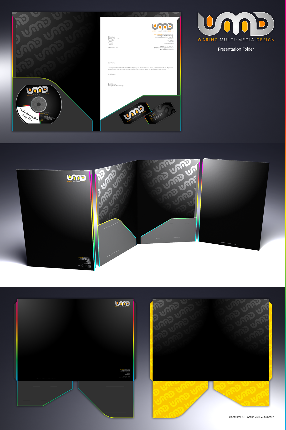
WMMD Presentation Folder


Glass Hill Presentation Folder


SAVIS Folder DRAFT by CAFxX


Presentation Folder by Tasos7


Green Air International by Peveus


F1 Function Presentation Folder by Hugo Silva


What kind of Funky Items have you put into your

Folders and Media kits?

Please leave  your comments below.

Posted on April 13, 2011July 11, 2017Author GiovanniCategories Designer Tutorials, Printing NewsTags advertising, brand, brand identity, Branding, brochure, business card, calendar, Catalog Printing, CMYK, custom, design, design inspiration, Illustrator, InDesign, large format, letterhead, logo, marketing, Media Kit, Pantone Matching System, Photoshop, poster, Presentation Folder, product marketing, service advertising, slits2 Comments on The Ultimate Marketing Piece – Eye Popping Media Kits
The Influence of Color – Color Psychology and the Subconscious

The Influence of Color – Color Psychology and the Subconscious

We live in a world of Color.

Everywhere you look color is influencing us consciously and subconsciously; naturally and synthetically: The blue sky, the green forests, the red stop sign, the green light. Color stimulates our emotions and motivates our decisions.

In this article we will investigate what some colors represent and how they can be used in your design.

Marketing and advertising employs the knowledge and practice of color psychology in its work to drive results. The main purpose of an ad is to motivate the viewer to take a course of action designated by the advertiser. Whether the call to action is to purchase a product, sign up for a contest or simply to modify the perception or mood towards a product or brand, color scheme is key to a successful campaign.

Color is applied to the shape of a logo to represent an emotion, objective, a meaning, as well as to increase brand recognition.

Colors can be presented and visualized as to signify verbs, circumstances, feelings, conditions, environments and objects to name a few.

Color Wheel Typography - Meaning of Colors

Make sure to use color to assist in getting your message across whether you are designing a sell sheet or a logo. Remember to keep in mind the perspective of potential viewers can make a difference in their perception of the design in its entirety. Not every color will affect every individual in the same fashion. It is possible that an individual experienced something involving a particular color and may react very differently from everyone else. It is important to investigate the potential hazardous impact that a color may cause when researching and choosing color schemes. This includes cultures and countries which may have a different meaning of colors.

Red

Red by Lisa91
Love, Warning, Energetic, Leadership, Ambition, Heat, Courage, Passion, Intensity, Aggression, Vibrant, Attention

Black

In Black and White by Bobby_j_lennon-d488fku
Power, Authority, Discipline, Confidence, Elegance, Secrecy, Sophisticated, Evil, Depth, Mystery

Blue

Blue by SplutPhoto
Peace, Cold, Water, Loyalty, Corporate, Seriousness, Sky, Authority, Security, Calmness, Productivity, Freedom, Cool


Green

Green by riktorsashen
Nature, fertility, Vigor, Inexperience, Patience, Growth, Money, Harmony, Refreshing, Health

Yellow

Yellow Heart by XxXBiancaXxX

In what way do colors affect you? Have you used color in your workspace to help you be more productive?

Please share your comments!

Posted on January 28, 2011February 17, 2015Author GiovanniCategories Color Tips, Designer Tutorials, Printing NewsTags advertising, brand, brand identity, Branding, CMYK, color, color psychology, color theory, Color Wheel, custom, design, design inspiration, InDesign, logo, Logo Design, marketing, pantone, Pantone Matching System, PMS, poster design, printing, product marketing6 Comments on The Influence of Color – Color Psychology and the Subconscious
A Colorful Guide to Understanding Color

A Colorful Guide to Understanding Color

– Vision gives us the ability to see color, but how many of us can truly explain or describe what color is or where it comes from?

This quick guide gives you a brief understanding of color, how it works, its application and how it affects your design and printing outcome.

Q. What is the definition of a color?

A. Color is the sensation produced in response to selective absorption of wavelengths from visible light. It possesses the attributes of Brightness, Colorfulness and Hue. – www.Color.org

Colored Pencils - 2007 Best PictureLight is emitted by a source such as the Sun or a light bulb. Only the colors that cannot be absorbed by an object are reflected. When the light is reflected into our eyes by the object, color is the result of receptors in the eye reacting to the specific wavelength of light.

So basically, the surface properties of the object actually reflect the colors that it does not absorb. The object itself does not emit the color.

Color Application

Color comparison - Ford MustangColor plays an extremely big roll in design. For those not already aware, color is a tool that goes beyond aesthetics and delves into the subconscious; besides our visual response, we also have an emotional response to color.

If you have a black muscle car that has 550hp under the hood and one day you decide to paint the whole thing purple, do you think the perception of the car – even though it still pushes 550hp – will remain the same? Would the viewer be more interested in the color of the car than the seconds it takes to get down the quarter-mile? With color you can control perception.

Our emotions also change the perception of an object based on its color. Our age, experiences with certain colors and other triggers all affect the perception of a color at the time of viewing.

Color Communication

Pantone Matching System PMS SwatchColor is defined by various properties and for the sake of communication, it has been given a name or number. Pink is a variation of red but it is distinctively a color in itself so a name was given to it. But how do we communicate the darkness or lightness of that pink? So can a yellow be referred to as Lemon Yellow or Canary Yellow, but to replicate it there must be a standard.

A system for coding color hues was developed in the 1900’s although today we have standards such as the Pantone Matching System® (PMS) which is widely used in the print and design industry and is the default matching system for popular graphic design software like Adobe® Photoshop, Illustrator and InDesign. With Pantone, a designer can designate a specific PMS color in his artwork and the printer all the way on the other side of the world can replicate the color exactly as the designer expected it to be via a Pantone swatch.


Color Vocabulary

Color Hue WheelHere you can find the definition of the most important properties of color. These will help you manipulate color and communicate efficiently.

Hue: a gradation or variety of a color. – dictionary.com

Chroma: the purity of a hue at its furthest from gray.

Saturation: the purity of a hue at is furthest from white.

Intensity: the strength or sharpness of a hue

Luminance: the amount of light reflected by the hue

Shade: a hue created by adding black

Tint: a hue created by adding white

Color Models

Color output is affected by the media it is applied to or displayed through. For web and print purposes I will only mention the Additive and Subtractive color models.

Red Green Blue (RGB) Primary Additive ColorsAdditive: The colors that you see now on your monitor are created by adding white (light) to black. As more color is added to the black screen, the closer it is to white. Red, Green and Blue (RGB) are the additive primary colors and combined together produce 100% white. The RGB model is used for web graphics.

CMYK color modelSubtractive: This color model is typically used for printing. By applying ink, the amount of white from the paper is reduced or subtracted. Cyan, Magenta and Yellow are the subtractive color primaries. Combining these three colors produces a muddy brownish black.  To achieve a better blacks and to save ink, black (K) was added to the mix. The CMYK model is used for print.


Color Types

Color WheelA color wheel is used to show the relationship between Primary, Secondary, Tertiary and Complementary colors.

Primary Colors are pure colors that cannot be made by mixing any combination of colors. The are in their purest form.

Secondary Colors are created by combining two primary colors.

Tertiary Colors are made by mixing primary and secondary colors.

Complementary Colors are those positioned directly across from each other in the color wheel.

Using a color wheel can clean up your color choices specially when using complementary colors. These are basically colors that complement each other and go well together. Many designs have beautiful structure but the chosen color combinations crash and take away from its beauty.

Both web and print designs can benefit greatly from understanding color and using a color wheel. Subscribe to our RSS feed or follow us on Twitter to stay tuned for the next post about Color and the Subconscious.

How would you explain color to someone who cannot see color?

Posted on January 21, 2011January 8, 2015Author GiovanniCategories Color Tips, Printing NewsTags additive, advertising, brand, brand identity, Branding, Brightness, Chroma, CMYK, color, color model, color monitor, color output, color tool, Color Wheel, Communication, Complementary color, design, design inspiration, Hue, Illustrator, InDesign, ink, Intensity, light, logo, Logo Design, Luminance, marketing, pantone, Pantone Matching System, Photoshop, PMS, print media, printing, product marketing, saturation, screen, shade, substrate, subtractive, Tint, toner2 Comments on A Colorful Guide to Understanding Color
How to Design a Print-Ready Holiday Greeting Card using Adobe Illustrator

How to Design a Print-Ready Holiday Greeting Card using Adobe Illustrator

It is the season for Holiday Cards and there is nothing more thoughtful than designing your own Custom Holiday Cards with your own message and graphics. Small business and corporations can benefit from sending a personalized corporate holiday greeting card to their customers and showing their gratitude for their business.

In this tutorial we will discuss how to create a print-ready design for our custom 5 x 7 folding holiday greeting cards using Adobe Illustrator.

Adobe Illustrator is a great vector graphics program to use for print design because it creates crisp, sharp lines for both shapes and text. It also makes it extremely easy to add bleeds and crops.

Quick note:
Vector graphics
is the use of geometrical primitives such as points, lines, curves, and shapes or polygon(s), which are all based on mathematical equations, to represent images in computer graphics. – Wikipedia

Step One: Creating the  document for Holiday cards

Open up Illustrator, click on File>New.
The New Document dialogue pops up:

Illustrator New Document Dialogue
Edited (thank you Ras!)


Since holiday cards are printed on flat sheets of paper, we will design using 10 x 7 as our dimensions (folded size is 5 x 7)

important:

We will also have graphics that bleed off the edge of the paper, for this we have to add 1/8th” (0.125″) bleed space all around to make sure the ink reaches the edge of our holiday cards for trimming.

Digital Toner Wells– Offset and digital printing presses use the CMYK color model to produce a wide array of colors in the final print. An offset press typically has 4 ink wells which are filled with Cyan (C), Magenta (M), Yellow (Y), and Black (K) ink and a digital press would have the same except using toner instead of ink.

– Your full color design will be divided into these 4 different colors at pre-press, this is called Color Separation and is done by the pre-press department using software called a RIP (Raster Image Processor). This creates plates for an offset press or a set of instructions for a digital press.

– Images and artwork documents should always be in 300dpi as a rule for best results.

Step Two: Using the Ruler to setup Guides

Click View>Show Rulers.

As a rule of thumb, always keep any text or images that do not reach the edge at least 1/8th inch (0.125″) away from the edge to avoid it getting cut off. Most templates that you can download have these guides marked as a “Safety Lines”.

Greeting Card Template Safety and Bleed Guides

Drag your guides from the top and left ruler and place them 1/8th” (0.125″) parallel to the black artboard line on the inside.

The outcome is a blue lined box inside of the black lined artboard where we will keep all text and graphics that do not bleed. This keeps all of the text and graphics from possibly getting cut off while being cut to the 5 x 7 size.

Template Artboard Bleed Safety Lines


Step Three: Begin Your Design

It is important to keep in mind the orientation of the card as it is folded.
This applies only to holiday greeting cards that fold horizontally. When designing the outside of the holiday card, you must account for the back outside panel to be upside down in your artwork.

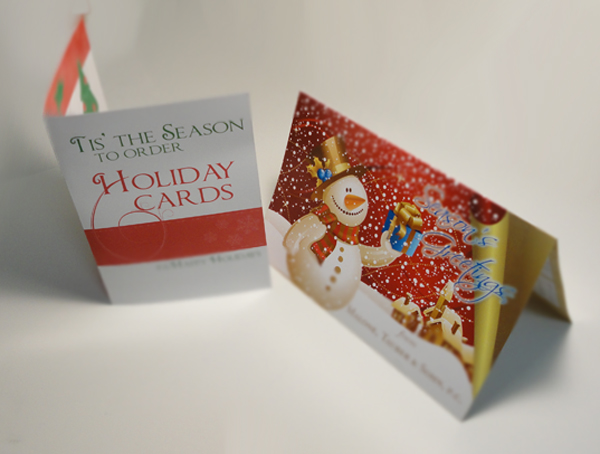
Folded Holiday Cards

Once all of these steps are in completed, you can rest assured that your Holiday greeting cards are print-ready.

Be sure to check out our Holiday Greeting Card Design Inspiration post to get some ideas flowing!

Posted on December 13, 2010August 20, 2014Author GiovanniCategories Designer Tutorials, Printing NewsTags advertising, brand identity, Branding, CMYK, color, corporate holiday cards, design inspiration, greeting cards, holiday cards, logo, marketing, printing, Vector12 Comments on How to Design a Print-Ready Holiday Greeting Card using Adobe Illustrator

Posts navigation

Page 1 Page 2 Next page
Proudly powered by WordPress