Barcode Printing

Barcode Printing Basics

Barcodes are just about everywhere these days. They make our life a lot more simple than we realize. Factories use them to control production. Shippers like USPS, UPS, and Fedex use them to track packages and monitor the flow of shipments. You can find them on government issued ID and at your local(or not so local) grocery store. Barcode printing is fairly simple, provided that the design is correct. But, let’s take a step back and find out what our black & white friends are all about.

Most people will recognize the UPC barcode below. It is most commonly found in retail stores.UPC Code

A barcode is simply a symbol that contains information, which, is read by a machine, which, is usually connected to a database.  They fall into 2 main categories, each of which has its own variations. A UPC code like the one above is a one dimensional barcode as it only takes advantage of the thickness of the bars and the spaces in between them.  Another example of a one dimensional code is something used by UPS or Fedex.

Here we have a QR code.QR Code This is an example of a two dimensional barcode. It takes advantage of the horizontal and vertical spacing. Originally created by vehicle manufacturers for production purposes, they are widely used today by mobile phone users for discounts or purchases. QR codes can also be placed on printed objects like posters or magazines and read by a mobile phone. This will open the phone’s web browser and take the user to a specific site or page. This is called a hardlink.

Why is this important to me?

Firstly, we chose the above codes because they are 2 major players in barcode printing. QR codes, while fairly new to some, have excellent benefits for consumers and businesses alike.  QR codes can also be generated easily and have given small businesses exposure they would not otherwise enjoy.

Companies like Amazon are giving UPC codes to new business owners and inventors. This allows someone who developed a gizmo in their garage to harness the power of a giant like Amazon and expose their products to millions of people, who would have been out of reach before.

Barcode printing

The first rule of barcode printing for a small business is to make sure your barcode is accurately adapted into your overall design. That, and well if it is possible, test it beforehand. A printing company can only accurately recreate what you need. But, whatever you give them to work with is ultimately what will come out the other side.

If your code is not active with vendors, suppliers or linked to the web, it won’t matter how perfect a job is done, it will not work. As we mentioned before, barcodes contain data, which, is linked with a database. So, if that database does not recognize the information stored within the barcode, or if the link on a QR is dead, well, you get the point. Another major point is that the quiet zone around the barcode should be no less than 1/4 inch. The quiet zone is a buffer that prevents a barcode reader from picking up any irrelevant data.

The good news is, there is a world of potential with these codes. Barcode printing is becoming more and more common and is an excellent marketing tool. Companies like ours have experience in barcode printing and can give you some pointers. Some companies also have a scanner lying arund and can try and test the finished product(only test, read the above paragraph). Choosing the right company is paramount, as we can help you avoid some of the pitfalls of printing barcodes. It is still important to note, however, that one must stay within the guidelines of what is set for that code. A lot of companies will tell you what size it can and cannot be and how much quiet space there should be. QR code generators will give you parameters as well.

Color QR Code with Logo

Benefits

QR Codes can also be enhanced to incorporate your logo and include color. This provides an excellent marketing opportunity for many small business. There is a segment of the population, though, that is still unfamiliar with QR codes. Still, many people have a phone on them that can scan QR codes easily.

Dynamic QR Codes can also have their information altered so that, you can use the same QR code but can alter the end result.

The potential for small businesses to use these codes to their benefit is growing daily. You can read more about it from a previous blog. Large corporations like Dunkin Donuts, Target, and Amazon use them to attract new customers and create calls to action. Small businesses can do the same, increase brand awareness, and attract customers in many ways.

All barcodes to need to be printed at some point. That is where an experience printing company can help. A restaurant can send an EDDM flyer with a QR code for 10% off. Or put a code in your brochure for special offers.  The options are endless.

Choose a company that has experience in barcode printing. Make sure your specification are accurate, then use your own ideas, our ideas here or from our previous blog on how to help increase your revenue. 


Free Fonts for Valentines Day Designs

Seasonal advertising brings lots of work for freelance and in-house designers. Valentine’s Day is a holiday that requires stunning visuals and some typographical romanticism.

Valentine’s Day: Love, Chocolate and Free Fonts

We hand picked these 3 romantic, love-inspired fonts for graphic designers to create graphics that convey the true feeling of Valentine’s Day. These free fonts are available for download and licensed free for commercial use. We did all the hard work of sorting through free font websites collecting these fonts that can be used in both personal and commercial Valentine’s day projects.

Please feel free to share links to any designs you create using these free fonts for Valentines Day!

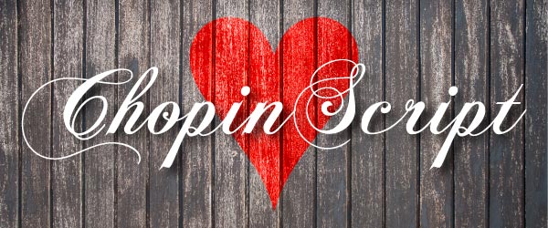
ChopinScript Font

Free Valentine Font ChopinScript

Lover’s Quarrel

Free Valentine Font Lover's Quarrel

Scriptina

Free Valentine Font Scriptina

Let us know how these free valentine fonts worked out in your design. Feel free to post a direct link  to the design you made in the comments. (links will be verified).

Creating Outlines from Type in Illustrator and InDesign


Outlining Type in Adobe Illustrator and Indesign

Why Do We Need to Outline Our Type?

Before sending a file to a printer, there are a few important steps that must be considered.  One of those is making sure that the type in the document is turned into outlines.  If the printer needs to make an adjustment to the file (fix color, adjust bleeds, etc.)  and the type is not outlined, there could be font issues that cause the copy to change or re-flow.  Sometimes these changes may not be noticed until after the job is printed.  It is a very simple process that only takes a moment.  Once it is done, the type is turned from a type box to vector outlines and can no longer be edited.  This tutorial is for Adobe programs such as Adobe Illustrator or Adobe Indesign. Always remember to check your copy before converting to outlines, because it can not be edited afterward.

Outlines Versus Type

How to Create the Outlined Type

In the above Image, the top line of text is type while the bottom line is outlines.  As you can see the outlines no longer have editable type; they have the individual vector points of the outlined shapes.  In order to outline the type, one needs to select the type box as a whole so that it looks like the below image.

Selecting a Text Box

Then if you are on a PC, press CTRL + SHIFT + O, or if you are on a Mac, press CMD + SHIFT + O.  The type can also be outlined from the top menu by selecting “type” then selecting “create outlines” from the drop down menu.  Afterwards your type will turn to paths and look like this image below.

Outlined Type

Finished Type Outlines

Now the type is outlined and safe to send to the printer. Remember to check that the other parts of the document are ready to go to pre-press before sending it to your printer.  Outlined type can be helpful when creating typographical designs; it removes the need to work with type boxes and allows direct editing of the shape of the characters directly.

5 Outstanding Websites to Download Free Commercial-Use Fonts


After you have read our latest posts about Typography, I am sure you are ready to get out there and start practicing and coming up with new Typography concepts for use in your designs. Now that you understand the difference between Serif and Sans Serif fonts, Kerning, Leading and Tracking and the principals of choosing fonts, we want to offer you a collection of websites that serve or link to [free] commercial-use fonts. The following 5 websites carry a vast array of fonts that you can use freely in both personal or commercial projects.

Download Some Nice Fonts, Create Amazing Typography and Share them with our Readers!

1. Font Squirrel

Font Squirrel Free Commercial-use fonts website
Great Collection of 100% Free Commercial-use Fonts. They also offer free @font-face kits and a free @font-face kit Generator. Filter by TrueType or OpenType and browse by font style.

2. FontSpace

Free Commercial-Use Font Website
Beautiful layout, contains both commercial-use and personal-use fonts which you can filter with the flick of a checkbox. Customize with your own text to preview the font. Great Browse function to discover new fonts.

3. Free Premium Fonts

Free Premium Fonts Free Commercial-use Fonts
Very clean layout, contains many free fonts for commercial or personal use. Type in your text to preview the font. Allows for comments for each font. Login to save favorites. Offers free and commercial font editing software.

4. Search Free Fonts

Search Free Fonts - Free Commercial-use Fonts Website
User-friendly website has a collection that contains over 13,000 free fonts and over 91,000 commercial fonts. Easy to navigate via categories and alphabetically.

5. Exljbris Font Foundry

Admirable collection of “Well crafted (free) fonts by Jos Buivenga”. Although a small collection, these font families are perfect for a variety of uses, clean and professional as is the website itself.


Remember, sharing is caring! Please feel free to link to your own typography tutorials or graphics that you made using fonts from the sites mentioned here today. Other designers may benefit or be inspired by your work so please share.


If you are using these fonts for a Print Project, feel free to call us at 1-877-mmprint or visit www.mmprint.com for a quote. We offer free shipping with all orders!

Typography – Choosing Appropriate Fonts

Typography: appropriate typefaces - choosing the appropriate font


The Timbre of Fonts

tim·bre/tambər/

Noun: The character or quality of a musical sound or voice as distinct from its pitch and intensity.

Comic Sans Office Note

Choosing an appropriate font for a design is very important.  Like sounds, I believe that fonts have timbre.  They can be described as having intangible properties that normally wouldn’t be associated with type such as being dark, violent, happy, sad, rugged or loud.  With that in mind, a design will benefit by choosing fonts which possess the appropriate timbre or tone and will help set the mood the overall design is meant to convey.

The First Step to Choosing the Right Font

Once the idea is established, a designer will need to understand how that idea needs to be conveyed.  A few points will have to be established in order to  do this:

  • Who is the target audience?
  • What is the idea?
  • Where will the design be?

These are just a few of the questions, but much will need to be determined.  Sticking with the standard who, what, when, where and why will be the simplest way to deduce the how.

Excellent Font Inspiration – Movie Posters

One of the best examples of both appropriate and inappropriate typefaces would be movie posters.  Movie posters need to grab attention and convey the timbre and idea of the movie very quickly. The posters will also have to be aesthetically pleasing at the same time. Since the movie itself already is the idea that needs to be conveyed, the imagery and timbre are already set.  The layout and fonts are what need to be established.  The design just has to focus around has already been established.

The “Cloverfield” poster has fonts that are similar to one you would find in a case report.  It supports the idea that there is a mystery or something can be classified.  The colors and blur on the text make it foreboding and also give the idea that this is science fiction and could be frightening.  After we switch the font to Comic Sans,  it turns into the box for a breakfast cereal; presumably one that is full of mystery.

Cloverfield Poster with Comic Sans


I picked two other posters that I felt had appropriate font choice and design. The “Australia” poster has a turn of the century feeling to it.  The colors give off a very rustic feeling and communicates the idea of being outdoors and limited to technology.  The font itself expresses some sort of entertainment or adventure.  It is the type of font you would have found on an old show poster or travel poster.  This typography brings you to the outback or the wild west and prepares you for adventure.
The “Transformers” Poster’s typography is sharp and looks like cut metal. The font is strong and bold.  The combination of the colors and font give it a serious timbre and express action. The typography tells you “Hey, we got robots.” without actually saying it.

Australia and Transformers Movie Poster Fonts

Typeface Lost and Found

Understanding the project and a clear statement is what is needed in choosing the correct typeface. Once determined, the designer will be able to feel what would be right. The typeface is chosen before the search begins.

Do your designs match your Fonts or do your Fonts match your designs?


Please leave your comments below…

Typography: Appropriate Typefaces – Serif vs. Sans-Serif

Typography Appropriate Typefaces - Serif and Sans-Serif

When working with typography, it is necessary to implement the most appropriate typefaces in order to correctly convey an idea.  The wrong typeface can create the wrong mood and mistake the purpose of the design.  In the most extreme case, the wrong typeface can even ruin the design. That being said, there are quite a few factors that need to be considered before deciding which typefaces to use. When deciding which typeface is needed to properly accentuate a design, one must properly categorize and then use process of elimination. The two largest classifications of typefaces would be serif and sans-serif fonts.

Serif Font Typography

A Little Bit of Serif History

Serifs are decorative accents on the end of strokes that make up each character. Serif fonts found their origin with the brush strokes used for creating early typefaces and eventually became standard.
Below is an example outlining the two defining characteristics of serif fonts: the decorative accents and the changes from thick to thin strokes throughout the individual characters.

Serifs are Decorative accents in Typefaces

Serifs: Good for the Eyes

Serif fonts can sometimes be referred to as Roman fonts because the Roman Engravings and writings often have serifs. Serif fonts are more common in print and smaller sizes.  The serifs are easily read and have been the standard for editorial copy. Serif fonts also are good for creating decorative designs or designs that need an older or more regal feel.

Sans-Serif Fonts are Easy to Read on Screen

The Sans-Serif fonts have better readability on screen.  Serif fonts have thick and thin strokes that can display unevenly on the screen causing parts that seem disproportionate and the readability in turn becomes impaired. Sans-serifs were traditionally used for accentuating type that needed to stand out because the strokes on sans-serifs are even while serif fonts have the thick and thin variation.  Sans-serif fonts have had many names through their existence.  The most common that still can be seen in some font names are “Gothic” and “Grotesque”.

Helvetica is a very popular Sans-Serif Font

Choosing between a serif and sans-serif is an important decision, but also is usually a simple one.  If the designer knows how they want to convey an idea and where it will be displayed, they have already decided if the font should be a serif or sans-serif.

After reading this article you are going to be very conscious of your choice to use serif or sans serif today, which will you be using?

More Than Words: An Introduction to the Art of Typography

Typography: an introduction


ty·pog·ra·phy:

Design or selection of letter forms to be organized into words and sentences and printed or displayed electronicallyEncyclopedia Britannica

When a person thinks of typography, what would immediately come to mind? Thoughts of different fonts, editorials and designs involving typographic elements would most likely be the first to come to mind. All of these possibilities are both synonymous to and would each be a part of what is considered typography. Typography is anything having to do with typefaces and their arrangements; more specifically it would refer to creating a functional design using type in an aesthetically pleasing manner.

Typography in our Surroundings

Everyday we are bombarded with typography. Every street we walk down, product we use, and every program we watch on television. It is found everywhere and in everything we do.  Right below we have some prime examples of typography that are all from different times and very different places.  Finding new typography everyday can be quite fun.  It is truly interesting to see how a designer decides to accomplish a task using the layout of type.

Typography in Design

Typography has become an important element in both print and web design. It allows designers to mix shapes and placement of letters and words along with the meaning that these characters represent in order to reinforce design and concept in a clever and unique way.
The type will be manipulated to convey specific points while moving your focus in a specific way around the design.  Typographic design is clean and direct.  Below I have a few found examples of typographic design which are aesthetically pleasing and display a point in a creative way.


Typography has existed for a long time and is in everything we see. It is both useful aesthetically and practically for conveying an idea.  Using typography for these means just requires some imagination.
The art of typography has many facets, please subscribe to our RSS Feed or follow us on Twitter to stay updated when new typography articles become available.

After reading this post, what typography are you going to now notice today?

Please tell us in the comments section below…