Christmas is almost here and we know that designers have tight deadlines for Christmas projects. We put together a list of awesome FREE Christmas fonts for commercial use that you can use in your designs for personal or commercial projects like holiday greeting cards, envelopes, postcards and any other fun Holiday projects you are working on. If you use any of the fonts listed, feel free to share a link to the artwork you did in the comments below!
Creating a die line for die cutting can be pretty simple or can be quite difficult, all depends on your design and some planning beforehand can come in very handy later on.
First, I want to make it clear that die cutting thin lines is not always a good idea. Thin lines in a die create thin cuts in the paper that can easily bend or rip off. Sometimes it’s unavoidable such as die cutting hair or thin fonts but if possible, always try to use thick locks of hair or bold type if your die cut is typography-based.
Custom Die Cut Hang Tags
For this tutorial we are going to create a Die Cut Hang Tag. Many clothing manufacturers use hang tags to brand their merchandise and sometimes include information about the product or the company on the back or inside if it is a folding hang tag.
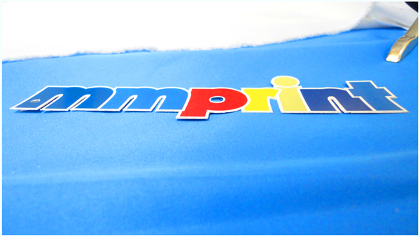
For this tutorial, we will use a fictitious Clothing Brand called mmprint.
Our goal is to have a finished hang tag where we will die cut the mmprint with the white Stroke around it. Leaving the grey area (which for purposes of this tutorial is simulating the paper) by using a die cutter such as our Heidelberg Windmill Letterpress.
The Right Tools
The die line must be made using a vector design program such as Adobe Illustrator or InDesign. A die maker uses a CNC (Computer Numerical Control) machine which uses CAD software to send the design commands to the CNC machine.
Since the CNC is computer controlled, it requires vector lines to operate. Raster lines are created using blocks which then create jagged edges along the perimeter of the line.
Preparing the Artwork
Creating the die line for the mmprint hang tag should be rather straight forward and simple. We used Century Gothic Bold for the text and made an offset path to make it thicker, then added a 3pt. Stroke around it. All we really need to do is make a line that goes around the entire perimeter of the white Stroke.
Sure, you can show off your Pen tool skills and trace the whole thing but working efficiently is key for a designer and when you have other projects to move on to, time is important.
At this point in our design, our stroke is an effect applied to the object. When you select the object with the black arrow, you will see that the selection line is located within the stroke. Since we need the die line to be the outside edge of the stroke, we have to make the stroke an object itself.
Select the mmprint object then click Edit>Copy then click Edit>Paste in Front
With the new object selected, click Object>Expand
While still selected, click the Unite button in the PathFinder tab (Window>Pathfinder)
Now you should have the outline of the object that is completely white, which notably is the shape that will remain in the sheet of paper once the mmprint is die cut out…
Now just 2 more steps.
While our new white object selected, all we need to do is give it a 1pt. stroke (I chose orange so it stands out) and remove the fill color.
Here is the result:
The orange line is the area where the die cut will be made
Cleaning Up
The final step is to convert the orange color we selected into a PMS color that we will call “Die Line”.
The purpose of making the die line its own PMS color is so that it separates correctly when making plates. The CMYK parts separate accordingly for printing and our “Die Line” PMS will separate as one separate plate for the die.
Here is how it’s done:
With the Die Line Layer selected, Double click the Orange color in your Swatches Panel.
Change the Swatch Name to “Die Line”, change Type to “Spot Color” and click OK
Notice the Orange color swatch has a White corner with a Black dot in it…this means it has been converted to a PMS color
Tips and Tricks
It’s always a good idea to consult with the printer/die cutter before you spend a lot of time on your design. Discuss and if possible, show a sketch or basic artwork of your die cut to get feedback on what may or may not work.
As a graphic designer/consultant, you are hired to be efficient and work within budgets.
To save on die charges, you can always use a pre-made Die Cut shapes and customize only the printing.
We offer a nice selection of pre-made die cut shapes:
Take the Design Even Further
When budget is not an obstacle, take your creativity to the next level with Foil Stamping and Embossing.
At this point you can design a hang tag with all the bells and whistles that people may possibly keep. Hang tags create an amazing opportunity to spread your branding with the very merchandise that you sell. Make your hang tag reflect the quality of your company and your product.
So how do you prepare the design for foil stamping and embossing?
Before sending a file to a printer, there are a few important steps that must be considered. One of those is making sure that the type in the document is turned into outlines. If the printer needs to make an adjustment to the file (fix color, adjust bleeds, etc.) and the type is not outlined, there could be font issues that cause the copy to change or re-flow. Sometimes these changes may not be noticed until after the job is printed. It is a very simple process that only takes a moment. Once it is done, the type is turned from a type box to vector outlines and can no longer be edited. This tutorial is for Adobe programs such as Adobe Illustrator or Adobe Indesign. Always remember to check your copy before converting to outlines, because it can not be edited afterward.
How to Create the Outlined Type
In the above Image, the top line of text is type while the bottom line is outlines. As you can see the outlines no longer have editable type; they have the individual vector points of the outlined shapes. In order to outline the type, one needs to select the type box as a whole so that it looks like the below image.
Then if you are on a PC, press CTRL + SHIFT + O, or if you are on a Mac, press CMD + SHIFT + O. The type can also be outlined from the top menu by selecting “type” then selecting “create outlines” from the drop down menu. Afterwards your type will turn to paths and look like this image below.
Finished Type Outlines
Now the type is outlined and safe to send to the printer. Remember to check that the other parts of the document are ready to go to pre-press before sending it to your printer. Outlined type can be helpful when creating typographical designs; it removes the need to work with type boxes and allows direct editing of the shape of the characters directly.
After you have read our latest posts about Typography, I am sure you are ready to get out there and start practicing and coming up with new Typography concepts for use in your designs. Now that you understand the difference between Serif and Sans Serif fonts, Kerning, Leading and Tracking and the principals of choosing fonts, we want to offer you a collection of websites that serve or link to [free] commercial-use fonts. The following 5 websites carry a vast array of fonts that you can use freely in both personal or commercial projects.
Download Some Nice Fonts, Create Amazing Typography and Share them with our Readers!
Great Collection of 100% Free Commercial-use Fonts. They also offer free @font-face kits and a free @font-face kit Generator. Filter by TrueType or OpenType and browse by font style.
Beautiful layout, contains both commercial-use and personal-use fonts which you can filter with the flick of a checkbox. Customize with your own text to preview the font. Great Browse function to discover new fonts.
Very clean layout, contains many free fonts for commercial or personal use. Type in your text to preview the font. Allows for comments for each font. Login to save favorites. Offers free and commercial font editing software.
User-friendly website has a collection that contains over 13,000 free fonts and over 91,000 commercial fonts. Easy to navigate via categories and alphabetically.
Admirable collection of “Well crafted (free) fonts by Jos Buivenga”. Although a small collection, these font families are perfect for a variety of uses, clean and professional as is the website itself.
Remember, sharing is caring! Please feel free to link to your own typography tutorials or graphics that you made using fonts from the sites mentioned here today. Other designers may benefit or be inspired by your work so please share.
Kerning and Leading are ways to manipulate the spacing between characters. Spatial manipulation in type can be a very important tool. Some fonts need to have individual characters adjusted to help create better readability and a more aesthetically pleasing layout. Changes to kerning and leading often go unnoticed, but in most situations that is what the designer will only want a subtle change that fixes readability.
Leading
Leading is the spacing between the baselines of type. The term leading is derived from the practice of placing lead strips between lines type on older hand set printing presses such as a letterpress. Adjusting the leading is also a very useful way of saving or using space on a page. Leading can also be used to change the aesthetics when dealing with a typographical design.
Kerning
Kerning is the spacing in between individual characters. Most fonts will have specific default kerning for individual character sets so that the spacing in between the letters in words feels more natural. The image below has a sentence with and without custom kerning applied in 5 different spots to show how subtle the change is. Most of the time, people will not realize that kerning was included to change the type of the design.
Tracking
Another adjustment to type that hasn’t been mentioned is Tracking. Tracking is very similar to kerning in that it is the spacing between individual characters, but tracking is the space between groups of letters rather than individual letters. Tracking affects the overall character density of the copy. Other than the actual effect that it could have on readability of type, tracking would be used to make lines of type even. Tracking will help to eliminate widows and orphans in paragraphs. Widows are when the final line of a paragraph begins a new column or page. Orphans are when paragraphs end in single words, part of words or a short phrase that seems out of place.
Noun: The character or quality of a musical sound or voice as distinct from its pitch and intensity.
Choosing an appropriate font for a design is very important. Like sounds, I believe that fonts have timbre. They can be described as having intangible properties that normally wouldn’t be associated with type such as being dark, violent, happy, sad, rugged or loud. With that in mind, a design will benefit by choosing fonts which possess the appropriate timbre or tone and will help set the mood the overall design is meant to convey.
The First Step to Choosing the Right Font
Once the idea is established, a designer will need to understand how that idea needs to be conveyed. A few points will have to be established in order to do this:
Who is the target audience?
What is the idea?
Where will the design be?
These are just a few of the questions, but much will need to be determined. Sticking with the standard who, what, when, where and why will be the simplest way to deduce the how.
Excellent Font Inspiration – Movie Posters
One of the best examples of both appropriate and inappropriate typefaces would be movie posters. Movie posters need to grab attention and convey the timbre and idea of the movie very quickly. The posters will also have to be aesthetically pleasing at the same time. Since the movie itself already is the idea that needs to be conveyed, the imagery and timbre are already set. The layout and fonts are what need to be established. The design just has to focus around has already been established.
The “Cloverfield” poster has fonts that are similar to one you would find in a case report. It supports the idea that there is a mystery or something can be classified. The colors and blur on the text make it foreboding and also give the idea that this is science fiction and could be frightening. After we switch the font to Comic Sans, it turns into the box for a breakfast cereal; presumably one that is full of mystery.
I picked two other posters that I felt had appropriate font choice and design. The “Australia” poster has a turn of the century feeling to it. The colors give off a very rustic feeling and communicates the idea of being outdoors and limited to technology. The font itself expresses some sort of entertainment or adventure. It is the type of font you would have found on an old show poster or travel poster. This typography brings you to the outback or the wild west and prepares you for adventure.
The “Transformers” Poster’s typography is sharp and looks like cut metal. The font is strong and bold. The combination of the colors and font give it a serious timbre and express action. The typography tells you “Hey, we got robots.” without actually saying it.
Typeface Lost and Found
Understanding the project and a clear statement is what is needed in choosing the correct typeface. Once determined, the designer will be able to feel what would be right. The typeface is chosen before the search begins.
Do your designs match your Fonts or do your Fonts match your designs?
When working with typography, it is necessary to implement the most appropriate typefaces in order to correctly convey an idea. The wrong typeface can create the wrong mood and mistake the purpose of the design. In the most extreme case, the wrong typeface can even ruin the design. That being said, there are quite a few factors that need to be considered before deciding which typefaces to use. When deciding which typeface is needed to properly accentuate a design, one must properly categorize and then use process of elimination. The two largest classifications of typefaces would be serif and sans-serif fonts.
A Little Bit of Serif History
Serifs are decorative accents on the end of strokes that make up each character. Serif fonts found their origin with the brush strokes used for creating early typefaces and eventually became standard.
Below is an example outlining the two defining characteristics of serif fonts: the decorative accents and the changes from thick to thin strokes throughout the individual characters.
Serifs: Good for the Eyes
Serif fonts can sometimes be referred to as Roman fonts because the Roman Engravings and writings often have serifs. Serif fonts are more common in print and smaller sizes. The serifs are easily read and have been the standard for editorial copy. Serif fonts also are good for creating decorative designs or designs that need an older or more regal feel.
The Sans-Serif fonts have better readability on screen. Serif fonts have thick and thin strokes that can display unevenly on the screen causing parts that seem disproportionate and the readability in turn becomes impaired. Sans-serifs were traditionally used for accentuating type that needed to stand out because the strokes on sans-serifs are even while serif fonts have the thick and thin variation. Sans-serif fonts have had many names through their existence. The most common that still can be seen in some font names are “Gothic” and “Grotesque”.
Choosing between a serif and sans-serif is an important decision, but also is usually a simple one. If the designer knows how they want to convey an idea and where it will be displayed, they have already decided if the font should be a serif or sans-serif.
After reading this article you are going to be very conscious of your choice to use serif or sans serif today, which will you be using?
Design or selection of letter forms to be organized into words and sentences and printed or displayed electronically – Encyclopedia Britannica
When a person thinks of typography, what would immediately come to mind? Thoughts of different fonts, editorials and designs involving typographic elements would most likely be the first to come to mind. All of these possibilities are both synonymous to and would each be a part of what is considered typography. Typography is anything having to do with typefaces and their arrangements; more specifically it would refer to creating a functional design using type in an aesthetically pleasing manner.
Typography in our Surroundings
Everyday we are bombarded with typography. Every street we walk down, product we use, and every program we watch on television. It is found everywhere and in everything we do. Right below we have some prime examples of typography that are all from different times and very different places. Finding new typography everyday can be quite fun. It is truly interesting to see how a designer decides to accomplish a task using the layout of type.
Typography in Design
Typography has become an important element in both print and web design. It allows designers to mix shapes and placement of letters and words along with the meaning that these characters represent in order to reinforce design and concept in a clever and unique way.
The type will be manipulated to convey specific points while moving your focus in a specific way around the design. Typographic design is clean and direct. Below I have a few found examples of typographic design which are aesthetically pleasing and display a point in a creative way.
Typography has existed for a long time and is in everything we see. It is both useful aesthetically and practically for conveying an idea. Using typography for these means just requires some imagination.
The art of typography has many facets, please subscribe to our RSS Feed or follow us on Twitter to stay updated when new typography articles become available.
After reading this post, what typography are you going to now notice today?