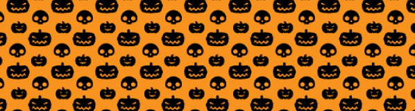
With Halloween right up our alley, it’s crunch time to get the Halloween graphics printed up. To save you time we put together this collection of Halloween vector graphics that are available for commercial use. No need to spend hours looking for the right vector only to come to find out that you can’t use it in your commercial project.
We carefully checked the license on each one of these so that you can download them and get right to work!
Halloween Pumpkin By Vector Open StockFree Vector Pumpkins Download from All SilhouettesMix and Match Pumpkin Faces from Designus
Halloween Banner Vectors
Vector Grunge Halloween Banners by All4Designer
Halloween Vector Patterns
Vector Halloween Pumpkin and Skull Pattern VectorPatterns UK
Free Vector Halloween Bat Pattern by VectorPatterns UK
[note]If your halloween project requires printing, please contact us at 516-334-1603 for amazing quality, super fast turnaround and free shipping![/note]
The process of setting up a Spot UV business card is different from what you are used to. Since the Spot UV coating is not actually “printed”, the area that is printed and the area that is Spot UV will require separate files.
Areas with UV (Spot) and Areas with No UV
Let’s make it clear, the purpose of spot UV coating is to cover only certain graphic areas on the card, not the whole flat side of the card. Think of it as highlighting the important parts of your business card so that they stand out. Not only that, but you can get really creative with spot UV coating and make a business card that leaves a lasting impression on the viewer.
The Printed Area
The printed area of the card doesn’t need any special layers or effects to prepare it for spot UV coating. The only thing you will do special might be to leave out certain objects that you might want to be spot UV only, without any printing under it giving it that “Ghost” effect.
In this example, the “m” was left out of the printing, only a solid orange was printed saturating the entire back side. The spot UV coating was applied to render the “Ghost” effect to the “m” and you can only see it in the light at certain angles… this is one of the owner’s business cards, we get WOW’s every time and most customers want it for their business cards.
The Spot UV Area
Believe it or not, it’s not that difficult to make a Spot UV file for the business card. Think of it this way, the UV coating is simply a clear color that you can put over any object in your design. Therefore, all you need to do is use black (100% K) representing the areas where the UV coating will be applied. Anything that is left white in the spot UV file will NOT have UV applied to it. Anything that is black (100% K), will. Simple as that.
[note color=”#d1d7c7″]I would not recommend doing this in Photoshop since the layer would be rasterized creating a jagged edge, use Illustrator which creates a vector layer instead for nice crisp clear edges.[/note]
The logo on the front of the card is important to us so we wanted it to stand out. How did we do it? Spot UV of course! It just jumps out at you when you’re looking at the card.
[note color=”#FFCC00″]Once you have setup your Spot UV business cards. Give us a call at 1877-mmprint to speak printing professional about your project or visit our Business Card Printing Page for more information and to request a quote. [/note]
[divider top=”1″]
Christmas is almost here and we know that designers have tight deadlines for Christmas projects. We put together a list of awesome FREE Christmas fonts for commercial use that you can use in your designs for personal or commercial projects like holiday greeting cards, envelopes, postcards and any other fun Holiday projects you are working on. If you use any of the fonts listed, feel free to share a link to the artwork you did in the comments below!
Creating a die line for die cutting can be pretty simple or can be quite difficult, all depends on your design and some planning beforehand can come in very handy later on.
First, I want to make it clear that die cutting thin lines is not always a good idea. Thin lines in a die create thin cuts in the paper that can easily bend or rip off. Sometimes it’s unavoidable such as die cutting hair or thin fonts but if possible, always try to use thick locks of hair or bold type if your die cut is typography-based.
Custom Die Cut Hang Tags
For this tutorial we are going to create a Die Cut Hang Tag. Many clothing manufacturers use hang tags to brand their merchandise and sometimes include information about the product or the company on the back or inside if it is a folding hang tag.
For this tutorial, we will use a fictitious Clothing Brand called mmprint.
Our goal is to have a finished hang tag where we will die cut the mmprint with the white Stroke around it. Leaving the grey area (which for purposes of this tutorial is simulating the paper) by using a die cutter such as our Heidelberg Windmill Letterpress.
The Right Tools
The die line must be made using a vector design program such as Adobe Illustrator or InDesign. A die maker uses a CNC (Computer Numerical Control) machine which uses CAD software to send the design commands to the CNC machine.
Since the CNC is computer controlled, it requires vector lines to operate. Raster lines are created using blocks which then create jagged edges along the perimeter of the line.
Preparing the Artwork
Creating the die line for the mmprint hang tag should be rather straight forward and simple. We used Century Gothic Bold for the text and made an offset path to make it thicker, then added a 3pt. Stroke around it. All we really need to do is make a line that goes around the entire perimeter of the white Stroke.
Sure, you can show off your Pen tool skills and trace the whole thing but working efficiently is key for a designer and when you have other projects to move on to, time is important.
At this point in our design, our stroke is an effect applied to the object. When you select the object with the black arrow, you will see that the selection line is located within the stroke. Since we need the die line to be the outside edge of the stroke, we have to make the stroke an object itself.
Select the mmprint object then click Edit>Copy then click Edit>Paste in Front
With the new object selected, click Object>Expand
While still selected, click the Unite button in the PathFinder tab (Window>Pathfinder)
Now you should have the outline of the object that is completely white, which notably is the shape that will remain in the sheet of paper once the mmprint is die cut out…
Now just 2 more steps.
While our new white object selected, all we need to do is give it a 1pt. stroke (I chose orange so it stands out) and remove the fill color.
Here is the result:
The orange line is the area where the die cut will be made
Cleaning Up
The final step is to convert the orange color we selected into a PMS color that we will call “Die Line”.
The purpose of making the die line its own PMS color is so that it separates correctly when making plates. The CMYK parts separate accordingly for printing and our “Die Line” PMS will separate as one separate plate for the die.
Here is how it’s done:
With the Die Line Layer selected, Double click the Orange color in your Swatches Panel.
Change the Swatch Name to “Die Line”, change Type to “Spot Color” and click OK
Notice the Orange color swatch has a White corner with a Black dot in it…this means it has been converted to a PMS color
Tips and Tricks
It’s always a good idea to consult with the printer/die cutter before you spend a lot of time on your design. Discuss and if possible, show a sketch or basic artwork of your die cut to get feedback on what may or may not work.
As a graphic designer/consultant, you are hired to be efficient and work within budgets.
To save on die charges, you can always use a pre-made Die Cut shapes and customize only the printing.
We offer a nice selection of pre-made die cut shapes:
Take the Design Even Further
When budget is not an obstacle, take your creativity to the next level with Foil Stamping and Embossing.
At this point you can design a hang tag with all the bells and whistles that people may possibly keep. Hang tags create an amazing opportunity to spread your branding with the very merchandise that you sell. Make your hang tag reflect the quality of your company and your product.
So how do you prepare the design for foil stamping and embossing?
This tool is one of my favorites within Illustrator. It does exactly as the name suggests, it creates a duplicate of an object with the path set off by a specified distance. It can create replicas of different size with standard distances between the original and replica and easily creates concentric shapes. It is great for creating large or smaller versions of objects or creating outlines that are shapes. It is also great for creating outlines around large groups of objects and creating shadows that are actual objects that can be edited independently from the object that would be casting the shadow.
How to use the Offset Path Tool
The offset path tool can be accessed from the Adobe Illustrator Menu from Object >> Path >> Offset Path. It will open the offset path tool box that asks what distance to offset the path, what type of joins for the corners and the miter limit. The distance used in the Offset field can be entered as a positive or negative which will make a shape that is either larger or smaller than the original.
Different Offsets
In the above image the offset path tool is used to create multiple concentric copies of the original shape in different sizes. In the purple example I created a smaller concentric copy by using negative values, while in the blue example I used the a positive value to create a larger concentric copy.
The offset tool can even be used to create multiple copies that can sit within one another. This effect is achieved by applying the offset tool twice as shown in the red and black example.
Different Join Types
The joins field in the offset path tool box modifies the type of angles the ends of the offset will have. There are three types, the miter which is a pointed corner, the round which is a rounded corner and the bevel which is a squared corner.
Miter Limit
The miter limit is how far the points can extrude from angles in the shape. Below there is an example of a high and low miter. The default is “4” which isn’t always the best for more acute angles. The second example with a miter of “20” actually allows for it to be much larger than what is displayed, so it is a bit of overkill.
The Difference Between Offset Path and Strokes
A similar effect can be created by applying a stroke to an object but a stroke and offset path are not the same, although they can look similar. The offset path is a replica that is evenly distanced from the original all around while the stroke is just an outline of a path. Also while resizing an object, the offset path will keep the proportions while the stroke will keep the same stroke size regardless of object size. Above we have an image of a stroke and an offset path around a line of text that has been reduced in size. Originally when the object was much larger they looked identical but as the object size changed more dramatically the stroke slowly became more out of place while the offset path still looks right. The stroke would have to be constantly adjusted or it would have to be outlined so that it can allow for size adjustments.
Using the Offset Path to Create Shadows
Creating an offset path of an object is a very handy way to create a shadow for that object. In the above graphic I created a shadow for the word tool by offsetting the graphic and then expanding it slightly. Afterward I used the feather on the offset and matched the color to the background. It isn’t hard and can create a nice shadow that is fully adjustable as an independent object.
Down the Right Path
The offset path tool is one of those tools that you do not hear much about but packs a big design punch when it comes to usefulness. Beyond the basic utilization illustrated in this post, the offset path tool can be used to create unique effects that can vary depending on the shape or object.
Please share any tips or tricks you may have discovered while using the offset path tool in the comments section!
After you have read our latest posts about Typography, I am sure you are ready to get out there and start practicing and coming up with new Typography concepts for use in your designs. Now that you understand the difference between Serif and Sans Serif fonts, Kerning, Leading and Tracking and the principals of choosing fonts, we want to offer you a collection of websites that serve or link to [free] commercial-use fonts. The following 5 websites carry a vast array of fonts that you can use freely in both personal or commercial projects.
Download Some Nice Fonts, Create Amazing Typography and Share them with our Readers!
Great Collection of 100% Free Commercial-use Fonts. They also offer free @font-face kits and a free @font-face kit Generator. Filter by TrueType or OpenType and browse by font style.
Beautiful layout, contains both commercial-use and personal-use fonts which you can filter with the flick of a checkbox. Customize with your own text to preview the font. Great Browse function to discover new fonts.
Very clean layout, contains many free fonts for commercial or personal use. Type in your text to preview the font. Allows for comments for each font. Login to save favorites. Offers free and commercial font editing software.
User-friendly website has a collection that contains over 13,000 free fonts and over 91,000 commercial fonts. Easy to navigate via categories and alphabetically.
Admirable collection of “Well crafted (free) fonts by Jos Buivenga”. Although a small collection, these font families are perfect for a variety of uses, clean and professional as is the website itself.
Remember, sharing is caring! Please feel free to link to your own typography tutorials or graphics that you made using fonts from the sites mentioned here today. Other designers may benefit or be inspired by your work so please share.
Kerning and Leading are ways to manipulate the spacing between characters. Spatial manipulation in type can be a very important tool. Some fonts need to have individual characters adjusted to help create better readability and a more aesthetically pleasing layout. Changes to kerning and leading often go unnoticed, but in most situations that is what the designer will only want a subtle change that fixes readability.
Leading
Leading is the spacing between the baselines of type. The term leading is derived from the practice of placing lead strips between lines type on older hand set printing presses such as a letterpress. Adjusting the leading is also a very useful way of saving or using space on a page. Leading can also be used to change the aesthetics when dealing with a typographical design.
Kerning
Kerning is the spacing in between individual characters. Most fonts will have specific default kerning for individual character sets so that the spacing in between the letters in words feels more natural. The image below has a sentence with and without custom kerning applied in 5 different spots to show how subtle the change is. Most of the time, people will not realize that kerning was included to change the type of the design.
Tracking
Another adjustment to type that hasn’t been mentioned is Tracking. Tracking is very similar to kerning in that it is the spacing between individual characters, but tracking is the space between groups of letters rather than individual letters. Tracking affects the overall character density of the copy. Other than the actual effect that it could have on readability of type, tracking would be used to make lines of type even. Tracking will help to eliminate widows and orphans in paragraphs. Widows are when the final line of a paragraph begins a new column or page. Orphans are when paragraphs end in single words, part of words or a short phrase that seems out of place.
Vector Logos of popular brands are sometimes hard to find for your designs…
Customers in need of design services are usually not knowledgeable of technical properties of design… that’s why they hire us to design it for them. More often then not, customer supplied files are not print-ready; product images and manufacturer logos pulled off of the internet, content written on a napkin, and anything else they can think of to make your job harder, but that’s why we charge by the hour, right?
Efficiency Saves Time and Money
A good portion of design time is used in searching the internet for brand logos or finding product images that are suitable for printing. It is a burdensome task and takes time and patience. As an honest designer or design company, it is extremely important to be efficient while producing quality design. Your efficiency allows you to work faster and to be more precise, which in turn saves your customers money on design time and at the same time also helps produce quality design quickly so that you can move on to the next project.
Finding Vector Logos of Popular Brands can be Easy
(Make sure to abide by the original copyright policies before downloading or using any corporate logos and not to infringe any copyright laws or terms of use)
Brands of the World – the largest library of freely downloadable vector logos
When You Can’t Find the Vector Logo You’re Looking For
on any of these sites, another option is to search directly for the logo which might be found in press releases or manuals typically found in PDF format. The easiest way to find PDF files is through Google’s Advanced Search option and choosing PDF in the file type field or by typing directly into the search bar like this:
Search: Netflix Logo filetype:pdf
At the time of writing this post, Google’s #1 search engine result renders a link to a Netflix API naming & Logo Guide PDF which contains a vector Netflix® Logo which can be extracted from the PDF by opening it in Adobe Illustrator. I like to use the brand name and the word logo to get a bit more specific search results. Sometimes it does not work so you must be a bit vague and use less specificity:
Search: Netflix filetype:pdf
Finding High Resolution Images of Commercial Products
(Make sure to abide by the original copyright policies before downloading or using any corporate/commercial images and not to infringe any copyright laws or terms of use)Now that you understand how to find vector logos in PDF, you can apply the same concept to finding high resolution images of commercial products that might not be easily found in print-ready format (large, 300dpi).
Search: Samsung Prevail filetype:pdf
At the time of writing this post, Yahoo’s #1 search engine result renders a link to a Boost Mobile Samsung Galaxy Prevai™ spec sheet that contains a high resolution image of the phone.
The Key is to be Resourceful
Another option to find high resolution product images is to begin by searching the company website for a Media section or search within the Site Map. Many corporations offer high resolution product images right on their websites for resellers and/or the media to use on their websites or print material. Corporations know that keeping consistent is smart business. Given this is the easiest and most convenient way of finding product images, not all corporate websites are created the same. Sometimes a high resolution image is simply not available online, at least not easily and you can’t spend hours upon hours finding one image.
Sometimes You Just Have to Make it Work
This option is a bit more time consuming but when your design quality matters to you and your client, then it is time well spent: Search the top three search engines for the product you are in need of and make sure to go to the “Images” section of each search engine. Many people and businesses take their own pictures of products with high megapixel cameras that render print-worthy images. Using Photoshop you can take the product right out of the picture and use it in your design. Make sure that your image is in CMYK format to avoid any color surprises when it prints. Adobe Illustrator and InDesign will accept RGB images to be placed within a CMYK document, but the document as a whole will be converted to CMYK at your printer. All brands and company names used here are copyright of their respectful owners.
What cool tips or tricks do you use to find product images or logos when you don’t have them?
Please share with other graphic designers by posting your comments below…
It is the season for Holiday Cards and there is nothing more thoughtful than designing your own Custom Holiday Cards with your own message and graphics. Small business and corporations can benefit from sending a personalized corporate holiday greeting card to their customers and showing their gratitude for their business.
In this tutorial we will discuss how to create a print-ready design for our custom 5 x 7 folding holiday greeting cards using Adobe Illustrator.
Adobe Illustrator is a great vector graphics program to use for print design because it creates crisp, sharp lines for both shapes and text. It also makes it extremely easy to add bleeds and crops.
Quick note:
Vector graphics is the use of geometrical primitives such as points, lines, curves, and shapes or polygon(s), which are all based on mathematical equations, to represent images in computer graphics. – Wikipedia
Step One: Creating the document forHoliday cards
Open up Illustrator, click on File>New.
The New Document dialogue pops up:
Edited (thank you Ras!)
Since holiday cards are printed on flat sheets of paper, we will design using 10 x 7 as our dimensions (folded size is 5 x 7)
important:
We will also have graphics that bleed off the edge of the paper, for this we have to add 1/8th” (0.125″) bleed space all around to make sure the ink reaches the edge of our holiday cards for trimming.
– Offset and digital printing presses use the CMYK color model to produce a wide array of colors in the final print. An offset press typically has 4 ink wells which are filled with Cyan (C), Magenta (M), Yellow (Y), and Black (K) ink and a digital press would have the same except using toner instead of ink.
– Your full color design will be divided into these 4 different colors at pre-press, this is called Color Separation and is done by the pre-press department using software called a RIP (Raster Image Processor). This creates plates for an offset press or a set of instructions for a digital press.
– Images and artwork documents should always be in 300dpi as a rule for best results.
Step Two: Using the Ruler to setup Guides
Click View>Show Rulers.
As a rule of thumb, always keep any text or images that do not reach the edge at least 1/8th inch (0.125″) away from the edge to avoid it getting cut off. Most templates that you can download have these guides marked as a “Safety Lines”.
Drag your guides from the top and left ruler and place them 1/8th” (0.125″) parallel to the black artboard line on the inside.
The outcome is a blue lined box inside of the black lined artboard where we will keep all text and graphics that do not bleed. This keeps all of the text and graphics from possibly getting cut off while being cut to the 5 x 7 size.
Step Three: Begin Your Design
It is important to keep in mind the orientation of the card as it is folded.
This applies only to holiday greeting cards that fold horizontally. When designing the outside of the holiday card, you must account for the back outside panel to be upside down in your artwork.
Once all of these steps are in completed, you can rest assured that your Holiday greeting cards are print-ready.