Typography – Choosing Appropriate Fonts

Typography: appropriate typefaces - choosing the appropriate font


The Timbre of Fonts

tim·bre/tambər/

Noun: The character or quality of a musical sound or voice as distinct from its pitch and intensity.

Comic Sans Office Note

Choosing an appropriate font for a design is very important.  Like sounds, I believe that fonts have timbre.  They can be described as having intangible properties that normally wouldn’t be associated with type such as being dark, violent, happy, sad, rugged or loud.  With that in mind, a design will benefit by choosing fonts which possess the appropriate timbre or tone and will help set the mood the overall design is meant to convey.

The First Step to Choosing the Right Font

Once the idea is established, a designer will need to understand how that idea needs to be conveyed.  A few points will have to be established in order to  do this:

  • Who is the target audience?
  • What is the idea?
  • Where will the design be?

These are just a few of the questions, but much will need to be determined.  Sticking with the standard who, what, when, where and why will be the simplest way to deduce the how.

Excellent Font Inspiration – Movie Posters

One of the best examples of both appropriate and inappropriate typefaces would be movie posters.  Movie posters need to grab attention and convey the timbre and idea of the movie very quickly. The posters will also have to be aesthetically pleasing at the same time. Since the movie itself already is the idea that needs to be conveyed, the imagery and timbre are already set.  The layout and fonts are what need to be established.  The design just has to focus around has already been established.

The “Cloverfield” poster has fonts that are similar to one you would find in a case report.  It supports the idea that there is a mystery or something can be classified.  The colors and blur on the text make it foreboding and also give the idea that this is science fiction and could be frightening.  After we switch the font to Comic Sans,  it turns into the box for a breakfast cereal; presumably one that is full of mystery.

Cloverfield Poster with Comic Sans


I picked two other posters that I felt had appropriate font choice and design. The “Australia” poster has a turn of the century feeling to it.  The colors give off a very rustic feeling and communicates the idea of being outdoors and limited to technology.  The font itself expresses some sort of entertainment or adventure.  It is the type of font you would have found on an old show poster or travel poster.  This typography brings you to the outback or the wild west and prepares you for adventure.
The “Transformers” Poster’s typography is sharp and looks like cut metal. The font is strong and bold.  The combination of the colors and font give it a serious timbre and express action. The typography tells you “Hey, we got robots.” without actually saying it.

Australia and Transformers Movie Poster Fonts

Typeface Lost and Found

Understanding the project and a clear statement is what is needed in choosing the correct typeface. Once determined, the designer will be able to feel what would be right. The typeface is chosen before the search begins.

Do your designs match your Fonts or do your Fonts match your designs?


Please leave your comments below…

The Earth Day Design Inspiration Collection

Mother Earth by josephine101April is an inspiring month full of colors and new beginnings. A month to celebrate All Fools day, Arbor day and Earth Day as well as a variety of holidays held by many different religions.

It is the month where small animals that hibernate through the winter break out of their slumber, bees and butterflies begin collecting the first drops of nectar made available by early-season flowers and the birds embark on their Northbound journey to settle and mate.

As a tribute to our Earth and the trees that provide us with Oxygen to breathe, remove Carbon Dioxide from the air and give us paper to print and archive beautiful art and genius design with:


Please enjoy this collection of Earth Day art and graphics from talented designers and artists:

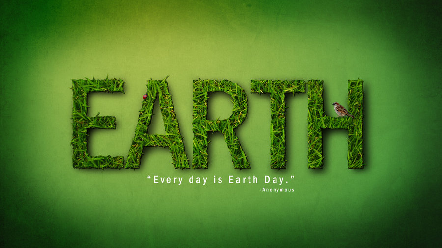
Earth by pixie meat

Earth Day Green Planet by AlexandraF


Earth Day by 'Famz

Happy Earth Day by xDreamx


Earth by klen70


Earth, Fire, Water, Air by Joffi


Earth day by InspiredInsanity


Earth Day by saki jr


How do you celebrate Earth Day?

Please comment below…


Magical Graphic Design: Houdini

Harry Houdini with his mother and wifeHarry Houdini once said:

My brain is the key that sets my mind free.”

As designers, the key is to keep the creativity fresh and inspired. Thinking outside of the box and out of the ordinary.

Harry Houdini was a creative innovator. His public acclamation came from showing people what they had never seen before, making that which was thought impossible seem possible. Although, for him it was a daily routine. He said it best:

“My professional life has been a constant record of disillusion, and many things that seem wonderful to most men are the every-day commonplaces of my business.”

Yet his inspiration is suggestive of the inspiration that drives a graphic designer to keep designing whether for profit or not: To go beyond the norm and create or build fantasy where none is found.

Here are some fascinating designs inspired by or dedicated to Harry Houdini:


The Great Houdini

The Great Houdini by Tena Letica


Houdini Records

Houdini Records

Harry Houdini by Derkert

Harry Houdini by Derkert


Houdini by Google

Houdini by Google


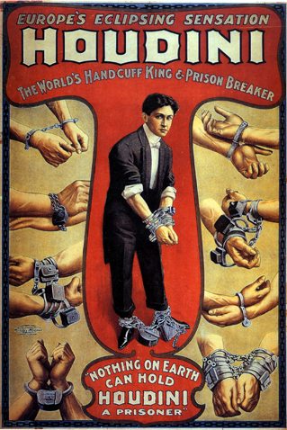
The Handcuff King

Houdini - The Handcuff King


Magic by Cruenta

Magic by Cruenta


A Kind of Magic by ReptileCynrik

A Kind of Magic by ReptileCynrik


Have any Magical Design Tricks to Share? Please do so in the Comments Below

Your Photos on Canvas – Like Hiring a Professional Painter

Photos on Canvas

Canvas Poster PrintingPhotographs are part of our lives and history. Many of our life’s anecdotes and achievements are captured to bring us back to these moments, share them with others, and rejoice with the memories.

A great way to immortalize these beautiful moments from the past is printing them on wonderful, sturdy, framed canvases. A canvas photo given to the right person can make a very touching gift, and can also add beauty and character to a room of the house.

Choose that special photo and make it even grander by having it printed on canvas.

Canvas Substrate Texture

No second thoughts, second chances

Even if your photos have suffered the weight of time and appear damaged, a graphic designer can take your old, worn pictures and clean them up with graphic design software such as Photoshop. The restoration process will awe you and surpass your expectations. Picture cropping, background changes, cleanups of minor flaws, and more. Not happy with the color? The color can be enhanced , modify the color, and even switch the whole image to sepia or black and white to fit the mood you desire. Once the image is ready to be printed, it can go in various canvas sizes, and finished with beautiful frames of your choice.

If you feel creative, you can arrange a number of your photos into one single collage.

Don’t shy away! Do you have any ideas we have not described? Discuss your preferences, ideas, and questions Below.

Colorful Collection of Poster Designs for Inspiration

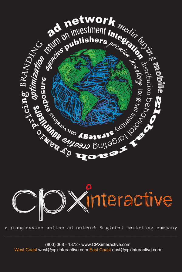
Poster by CPX InteractiveWhen promoting a band, a new product, service or simply to convey information, a full color poster will STAND OUT like capital letters in any text message.

Posters are designed to be hung on walls and many other large flat surfaces. Their large format allow for both text and images to promote events, use as an informational guide and can even be educational.

Posters can be printed on many different substrates.  To name a few: vinyl for durability, art canvas to give it an “artsy” finish or even acetate for more creative works. Posters can even be mounted on different materials or framed. Foamcore and Gatorboard are frequently used and allow for the poster to stand on its own or be displayed on an easel.

Here is a collection of beautiful and colorful posters that will hopefully strike a spark in your brain and ignite a creative fire that will make your next poster design STAND OUT beyond it’s size…

Poster by Beaucoupzero

Poster by Ellyezer

Poster by Etrix

K-Salaam and Beatnick Poster

Poster by MrHahn98

Bauhaus Poster by DT1087

Poster by StrongstuffPoster by Aremanvin

Poster by Zivrezcara

Poster by C345

BLACKOUT_POSTER_by_Demen1

[box title=”Word To The Wise” color=”#333333″]Get Inspired, Design Something Amazing and Have it Professionally Printed. Call us 516-334-1603[/box]

Amazing CMYK Inspired Designs


Printers and print designers eat, breathe and sweat CMYK.
One of the most common mistakes made when beginning a print design is to make sure the Mode is set to CMYK.

What better way to embed CMYK mode into your brain to make sure your design is correctly formatted for printing?

A showcase of Incredible Full Color CMYK Posters for reference and inspiration!

CMYK by BlackTSpawN

CMYK by DecadentBlend.com

CMYK by Shanthora

CMYK by Nellmckellar

CMYK by Seba300

CMYK Splatter

Have you had any beginner mistakes or simple “I can’t believe I did that!” mishaps in a design that you would like to share?

Share your must-see CMYK inspired designs too…