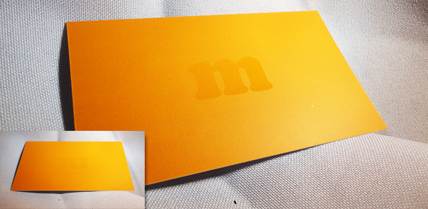
The process of setting up a Spot UV business card is different from what you are used to. Since the Spot UV coating is not actually “printed”, the area that is printed and the area that is Spot UV will require separate files.
Areas with UV (Spot) and Areas with No UV
Let’s make it clear, the purpose of spot UV coating is to cover only certain graphic areas on the card, not the whole flat side of the card. Think of it as highlighting the important parts of your business card so that they stand out. Not only that, but you can get really creative with spot UV coating and make a business card that leaves a lasting impression on the viewer.
The Printed Area
The printed area of the card doesn’t need any special layers or effects to prepare it for spot UV coating. The only thing you will do special might be to leave out certain objects that you might want to be spot UV only, without any printing under it giving it that “Ghost” effect.
In this example, the “m” was left out of the printing, only a solid orange was printed saturating the entire back side. The spot UV coating was applied to render the “Ghost” effect to the “m” and you can only see it in the light at certain angles… this is one of the owner’s business cards, we get WOW’s every time and most customers want it for their business cards.
The Spot UV Area
Believe it or not, it’s not that difficult to make a Spot UV file for the business card. Think of it this way, the UV coating is simply a clear color that you can put over any object in your design. Therefore, all you need to do is use black (100% K) representing the areas where the UV coating will be applied. Anything that is left white in the spot UV file will NOT have UV applied to it. Anything that is black (100% K), will. Simple as that.
[note color=”#d1d7c7″]I would not recommend doing this in Photoshop since the layer would be rasterized creating a jagged edge, use Illustrator which creates a vector layer instead for nice crisp clear edges.[/note]
The logo on the front of the card is important to us so we wanted it to stand out. How did we do it? Spot UV of course! It just jumps out at you when you’re looking at the card.
[note color=”#FFCC00″]Once you have setup your Spot UV business cards. Give us a call at 1877-mmprint to speak printing professional about your project or visit our Business Card Printing Page for more information and to request a quote. [/note]
[divider top=”1″]
Creating a die line for die cutting can be pretty simple or can be quite difficult, all depends on your design and some planning beforehand can come in very handy later on.
First, I want to make it clear that die cutting thin lines is not always a good idea. Thin lines in a die create thin cuts in the paper that can easily bend or rip off. Sometimes it’s unavoidable such as die cutting hair or thin fonts but if possible, always try to use thick locks of hair or bold type if your die cut is typography-based.
Custom Die Cut Hang Tags
For this tutorial we are going to create a Die Cut Hang Tag. Many clothing manufacturers use hang tags to brand their merchandise and sometimes include information about the product or the company on the back or inside if it is a folding hang tag.
For this tutorial, we will use a fictitious Clothing Brand called mmprint.
Our goal is to have a finished hang tag where we will die cut the mmprint with the white Stroke around it. Leaving the grey area (which for purposes of this tutorial is simulating the paper) by using a die cutter such as our Heidelberg Windmill Letterpress.
The Right Tools
The die line must be made using a vector design program such as Adobe Illustrator or InDesign. A die maker uses a CNC (Computer Numerical Control) machine which uses CAD software to send the design commands to the CNC machine.
Since the CNC is computer controlled, it requires vector lines to operate. Raster lines are created using blocks which then create jagged edges along the perimeter of the line.
Preparing the Artwork
Creating the die line for the mmprint hang tag should be rather straight forward and simple. We used Century Gothic Bold for the text and made an offset path to make it thicker, then added a 3pt. Stroke around it. All we really need to do is make a line that goes around the entire perimeter of the white Stroke.
Sure, you can show off your Pen tool skills and trace the whole thing but working efficiently is key for a designer and when you have other projects to move on to, time is important.
At this point in our design, our stroke is an effect applied to the object. When you select the object with the black arrow, you will see that the selection line is located within the stroke. Since we need the die line to be the outside edge of the stroke, we have to make the stroke an object itself.
Select the mmprint object then click Edit>Copy then click Edit>Paste in Front
With the new object selected, click Object>Expand
While still selected, click the Unite button in the PathFinder tab (Window>Pathfinder)
Now you should have the outline of the object that is completely white, which notably is the shape that will remain in the sheet of paper once the mmprint is die cut out…
Now just 2 more steps.
While our new white object selected, all we need to do is give it a 1pt. stroke (I chose orange so it stands out) and remove the fill color.
Here is the result:
The orange line is the area where the die cut will be made
Cleaning Up
The final step is to convert the orange color we selected into a PMS color that we will call “Die Line”.
The purpose of making the die line its own PMS color is so that it separates correctly when making plates. The CMYK parts separate accordingly for printing and our “Die Line” PMS will separate as one separate plate for the die.
Here is how it’s done:
With the Die Line Layer selected, Double click the Orange color in your Swatches Panel.
Change the Swatch Name to “Die Line”, change Type to “Spot Color” and click OK
Notice the Orange color swatch has a White corner with a Black dot in it…this means it has been converted to a PMS color
Tips and Tricks
It’s always a good idea to consult with the printer/die cutter before you spend a lot of time on your design. Discuss and if possible, show a sketch or basic artwork of your die cut to get feedback on what may or may not work.
As a graphic designer/consultant, you are hired to be efficient and work within budgets.
To save on die charges, you can always use a pre-made Die Cut shapes and customize only the printing.
We offer a nice selection of pre-made die cut shapes:
Take the Design Even Further
When budget is not an obstacle, take your creativity to the next level with Foil Stamping and Embossing.
At this point you can design a hang tag with all the bells and whistles that people may possibly keep. Hang tags create an amazing opportunity to spread your branding with the very merchandise that you sell. Make your hang tag reflect the quality of your company and your product.
So how do you prepare the design for foil stamping and embossing?
After you have read our latest posts about Typography, I am sure you are ready to get out there and start practicing and coming up with new Typography concepts for use in your designs. Now that you understand the difference between Serif and Sans Serif fonts, Kerning, Leading and Tracking and the principals of choosing fonts, we want to offer you a collection of websites that serve or link to [free] commercial-use fonts. The following 5 websites carry a vast array of fonts that you can use freely in both personal or commercial projects.
Download Some Nice Fonts, Create Amazing Typography and Share them with our Readers!
Great Collection of 100% Free Commercial-use Fonts. They also offer free @font-face kits and a free @font-face kit Generator. Filter by TrueType or OpenType and browse by font style.
Beautiful layout, contains both commercial-use and personal-use fonts which you can filter with the flick of a checkbox. Customize with your own text to preview the font. Great Browse function to discover new fonts.
Very clean layout, contains many free fonts for commercial or personal use. Type in your text to preview the font. Allows for comments for each font. Login to save favorites. Offers free and commercial font editing software.
User-friendly website has a collection that contains over 13,000 free fonts and over 91,000 commercial fonts. Easy to navigate via categories and alphabetically.
Admirable collection of “Well crafted (free) fonts by Jos Buivenga”. Although a small collection, these font families are perfect for a variety of uses, clean and professional as is the website itself.
Remember, sharing is caring! Please feel free to link to your own typography tutorials or graphics that you made using fonts from the sites mentioned here today. Other designers may benefit or be inspired by your work so please share.
Kerning and Leading are ways to manipulate the spacing between characters. Spatial manipulation in type can be a very important tool. Some fonts need to have individual characters adjusted to help create better readability and a more aesthetically pleasing layout. Changes to kerning and leading often go unnoticed, but in most situations that is what the designer will only want a subtle change that fixes readability.
Leading
Leading is the spacing between the baselines of type. The term leading is derived from the practice of placing lead strips between lines type on older hand set printing presses such as a letterpress. Adjusting the leading is also a very useful way of saving or using space on a page. Leading can also be used to change the aesthetics when dealing with a typographical design.
Kerning
Kerning is the spacing in between individual characters. Most fonts will have specific default kerning for individual character sets so that the spacing in between the letters in words feels more natural. The image below has a sentence with and without custom kerning applied in 5 different spots to show how subtle the change is. Most of the time, people will not realize that kerning was included to change the type of the design.
Tracking
Another adjustment to type that hasn’t been mentioned is Tracking. Tracking is very similar to kerning in that it is the spacing between individual characters, but tracking is the space between groups of letters rather than individual letters. Tracking affects the overall character density of the copy. Other than the actual effect that it could have on readability of type, tracking would be used to make lines of type even. Tracking will help to eliminate widows and orphans in paragraphs. Widows are when the final line of a paragraph begins a new column or page. Orphans are when paragraphs end in single words, part of words or a short phrase that seems out of place.
Vector Logos of popular brands are sometimes hard to find for your designs…
Customers in need of design services are usually not knowledgeable of technical properties of design… that’s why they hire us to design it for them. More often then not, customer supplied files are not print-ready; product images and manufacturer logos pulled off of the internet, content written on a napkin, and anything else they can think of to make your job harder, but that’s why we charge by the hour, right?
Efficiency Saves Time and Money
A good portion of design time is used in searching the internet for brand logos or finding product images that are suitable for printing. It is a burdensome task and takes time and patience. As an honest designer or design company, it is extremely important to be efficient while producing quality design. Your efficiency allows you to work faster and to be more precise, which in turn saves your customers money on design time and at the same time also helps produce quality design quickly so that you can move on to the next project.
Finding Vector Logos of Popular Brands can be Easy
(Make sure to abide by the original copyright policies before downloading or using any corporate logos and not to infringe any copyright laws or terms of use)
Brands of the World – the largest library of freely downloadable vector logos
When You Can’t Find the Vector Logo You’re Looking For
on any of these sites, another option is to search directly for the logo which might be found in press releases or manuals typically found in PDF format. The easiest way to find PDF files is through Google’s Advanced Search option and choosing PDF in the file type field or by typing directly into the search bar like this:
Search: Netflix Logo filetype:pdf
At the time of writing this post, Google’s #1 search engine result renders a link to a Netflix API naming & Logo Guide PDF which contains a vector Netflix® Logo which can be extracted from the PDF by opening it in Adobe Illustrator. I like to use the brand name and the word logo to get a bit more specific search results. Sometimes it does not work so you must be a bit vague and use less specificity:
Search: Netflix filetype:pdf
Finding High Resolution Images of Commercial Products
(Make sure to abide by the original copyright policies before downloading or using any corporate/commercial images and not to infringe any copyright laws or terms of use)Now that you understand how to find vector logos in PDF, you can apply the same concept to finding high resolution images of commercial products that might not be easily found in print-ready format (large, 300dpi).
Search: Samsung Prevail filetype:pdf
At the time of writing this post, Yahoo’s #1 search engine result renders a link to a Boost Mobile Samsung Galaxy Prevai™ spec sheet that contains a high resolution image of the phone.
The Key is to be Resourceful
Another option to find high resolution product images is to begin by searching the company website for a Media section or search within the Site Map. Many corporations offer high resolution product images right on their websites for resellers and/or the media to use on their websites or print material. Corporations know that keeping consistent is smart business. Given this is the easiest and most convenient way of finding product images, not all corporate websites are created the same. Sometimes a high resolution image is simply not available online, at least not easily and you can’t spend hours upon hours finding one image.
Sometimes You Just Have to Make it Work
This option is a bit more time consuming but when your design quality matters to you and your client, then it is time well spent: Search the top three search engines for the product you are in need of and make sure to go to the “Images” section of each search engine. Many people and businesses take their own pictures of products with high megapixel cameras that render print-worthy images. Using Photoshop you can take the product right out of the picture and use it in your design. Make sure that your image is in CMYK format to avoid any color surprises when it prints. Adobe Illustrator and InDesign will accept RGB images to be placed within a CMYK document, but the document as a whole will be converted to CMYK at your printer. All brands and company names used here are copyright of their respectful owners.
What cool tips or tricks do you use to find product images or logos when you don’t have them?
Please share with other graphic designers by posting your comments below…
When working with typography, it is necessary to implement the most appropriate typefaces in order to correctly convey an idea. The wrong typeface can create the wrong mood and mistake the purpose of the design. In the most extreme case, the wrong typeface can even ruin the design. That being said, there are quite a few factors that need to be considered before deciding which typefaces to use. When deciding which typeface is needed to properly accentuate a design, one must properly categorize and then use process of elimination. The two largest classifications of typefaces would be serif and sans-serif fonts.
A Little Bit of Serif History
Serifs are decorative accents on the end of strokes that make up each character. Serif fonts found their origin with the brush strokes used for creating early typefaces and eventually became standard.
Below is an example outlining the two defining characteristics of serif fonts: the decorative accents and the changes from thick to thin strokes throughout the individual characters.
Serifs: Good for the Eyes
Serif fonts can sometimes be referred to as Roman fonts because the Roman Engravings and writings often have serifs. Serif fonts are more common in print and smaller sizes. The serifs are easily read and have been the standard for editorial copy. Serif fonts also are good for creating decorative designs or designs that need an older or more regal feel.
The Sans-Serif fonts have better readability on screen. Serif fonts have thick and thin strokes that can display unevenly on the screen causing parts that seem disproportionate and the readability in turn becomes impaired. Sans-serifs were traditionally used for accentuating type that needed to stand out because the strokes on sans-serifs are even while serif fonts have the thick and thin variation. Sans-serif fonts have had many names through their existence. The most common that still can be seen in some font names are “Gothic” and “Grotesque”.
Choosing between a serif and sans-serif is an important decision, but also is usually a simple one. If the designer knows how they want to convey an idea and where it will be displayed, they have already decided if the font should be a serif or sans-serif.
After reading this article you are going to be very conscious of your choice to use serif or sans serif today, which will you be using?
As printers and print designers we are constantly submerged mentally and physically in the realm of CMYK. These four letters are the rule of the print industry and the basis for almost everything that we print. To increase your understanding of the CMYK color mode, please read our popular Colorful Guide to Understanding Color which explains color mode differences and why CMYK is used in printing while RGB is used for the web.
Corporate logo designers know very well that a complete logo design package requires both PMS and CMYK versions of a logo so that all advertising mediums such as print and web are covered. This has mostly to do with color consistency. CMYK values that represent the PMS version should be determined to keep this consistency throughout all marketing campaigns (not to mention RGB for web graphics).
As we grow as designers and printers, our love for the CMYK acronym grows and for those of you out there who know the feeling, we have come up with this collection of beautiful CMYK inspired vector logos from all over the world for your design inspiration:
Notice that almost all of the CMYK inspired logos above are Print companies or have the word Print in them. As I said before, printers and print designers are CMYK fanatics!
What logos or other advertising have you noticed or designed that are CMYK inspired?
Design or selection of letter forms to be organized into words and sentences and printed or displayed electronically – Encyclopedia Britannica
When a person thinks of typography, what would immediately come to mind? Thoughts of different fonts, editorials and designs involving typographic elements would most likely be the first to come to mind. All of these possibilities are both synonymous to and would each be a part of what is considered typography. Typography is anything having to do with typefaces and their arrangements; more specifically it would refer to creating a functional design using type in an aesthetically pleasing manner.
Typography in our Surroundings
Everyday we are bombarded with typography. Every street we walk down, product we use, and every program we watch on television. It is found everywhere and in everything we do. Right below we have some prime examples of typography that are all from different times and very different places. Finding new typography everyday can be quite fun. It is truly interesting to see how a designer decides to accomplish a task using the layout of type.
Typography in Design
Typography has become an important element in both print and web design. It allows designers to mix shapes and placement of letters and words along with the meaning that these characters represent in order to reinforce design and concept in a clever and unique way.
The type will be manipulated to convey specific points while moving your focus in a specific way around the design. Typographic design is clean and direct. Below I have a few found examples of typographic design which are aesthetically pleasing and display a point in a creative way.
Typography has existed for a long time and is in everything we see. It is both useful aesthetically and practically for conveying an idea. Using typography for these means just requires some imagination.
The art of typography has many facets, please subscribe to our RSS Feed or follow us on Twitter to stay updated when new typography articles become available.
After reading this post, what typography are you going to now notice today?
April is an inspiring month full of colors and new beginnings. A month to celebrate All Fools day, Arbor day and Earth Day as well as a variety of holidays held by many different religions.
It is the month where small animals that hibernate through the winter break out of their slumber, bees and butterflies begin collecting the first drops of nectar made available by early-season flowers and the birds embark on their Northbound journey to settle and mate.
As a tribute to our Earth and the trees that provide us with Oxygen to breathe, remove Carbon Dioxide from the air and give us paper to print and archive beautiful art and genius design with:
Please enjoy this collection of Earth Day art and graphics from talented designers and artists:
Everywhere you look color is influencing us consciously and subconsciously; naturally and synthetically: The blue sky, the green forests, the red stop sign, the green light. Color stimulates our emotions and motivates our decisions.
In this article we will investigate what some colors represent and how they can be used in your design.
Marketing and advertising employs the knowledge and practice of color psychology in its work to drive results. The main purpose of an ad is to motivate the viewer to take a course of action designated by the advertiser. Whether the call to action is to purchase a product, sign up for a contest or simply to modify the perception or mood towards a product or brand, color scheme is key to a successful campaign.
Colors can be presented and visualized as to signify verbs, circumstances, feelings, conditions, environments and objects to name a few.
Make sure to use color to assist in getting your message across whether you are designing a sell sheet or a logo. Remember to keep in mind the perspective of potential viewers can make a difference in their perception of the design in its entirety. Not every color will affect every individual in the same fashion. It is possible that an individual experienced something involving a particular color and may react very differently from everyone else. It is important to investigate the potential hazardous impact that a color may cause when researching and choosing color schemes. This includes cultures and countries which may have a different meaning of colors.