Lookbook Design Tips – Style And Fashion

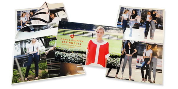
Lookbooks seem to be the latest craze for fashion start-ups and clothing lines. I can attest to this statement because it’s been our hottest selling product for the 3rd and 4th quarter of 2013 and probably would have been for longer than that… had we paid more attention to this trend earlier in the year.

The difference between a lookbook and a catalog is in the content. Lookbooks showcase your fashion/clothing line’s look and style and doesn’t get into too much detail because it’s all about imagery, hence the name “Look” book.

A lookbook design sets the stage for your target market and with these tips you will be able to create an environment that they can relate to and see themselves in it.


Lookbook Design Showcase


Simple and Subtle Imagery

Lookbooks are made for looking. Simple as that. No need to create distraction with overwhelming amounts of text or disruptive graphics that take the focus away from your product.

You may opt for a solid color background usually gentle whites or light greys that contrast with the colors of your models and clothing. Even shadows can draw the eyes away from the target, make sure your lighting conditions are optimal.


Fashion Lookbook Designs


Use Your Environment

For the seasonal or niche fashion-eers, the background can be used to your advantage. Create a habitat where your fashion lives, where you target market finds themselves. Help them envision how your style fits their lifestyle.


Lookbook Design and Printing


 Gloss, Gloss… Gloss.

The paper you select for your lookbook printing can really influence the outcome.  In my opinion, nothing makes photographs POP like a glossy finish, the good news is most small runs of lookbooks are printed digitally…

Digital printing uses toner which has a glossy finish anyway so basically you can print on uncoated or matte paper and still have a glossy finish. I’ve seen this used to give the printed areas a 3D type effect or can be comparable to Spot UV coating.


We're Here to Help
We understand how busy you are taking care of your business and you may not have the time to spend creating a design for your lookbook. That’s what we’re here for! Give us the photographs and we’ll take care of creating an amazing lookbook for your fashion/clothing line.

Request A Lookbook Printing Quote Now!

5 Outstanding Websites to Download Free Commercial-Use Fonts


After you have read our latest posts about Typography, I am sure you are ready to get out there and start practicing and coming up with new Typography concepts for use in your designs. Now that you understand the difference between Serif and Sans Serif fonts, Kerning, Leading and Tracking and the principals of choosing fonts, we want to offer you a collection of websites that serve or link to [free] commercial-use fonts. The following 5 websites carry a vast array of fonts that you can use freely in both personal or commercial projects.

Download Some Nice Fonts, Create Amazing Typography and Share them with our Readers!

1. Font Squirrel

Font Squirrel Free Commercial-use fonts website
Great Collection of 100% Free Commercial-use Fonts. They also offer free @font-face kits and a free @font-face kit Generator. Filter by TrueType or OpenType and browse by font style.

2. FontSpace

Free Commercial-Use Font Website
Beautiful layout, contains both commercial-use and personal-use fonts which you can filter with the flick of a checkbox. Customize with your own text to preview the font. Great Browse function to discover new fonts.

3. Free Premium Fonts

Free Premium Fonts Free Commercial-use Fonts
Very clean layout, contains many free fonts for commercial or personal use. Type in your text to preview the font. Allows for comments for each font. Login to save favorites. Offers free and commercial font editing software.

4. Search Free Fonts

Search Free Fonts - Free Commercial-use Fonts Website
User-friendly website has a collection that contains over 13,000 free fonts and over 91,000 commercial fonts. Easy to navigate via categories and alphabetically.

5. Exljbris Font Foundry

Admirable collection of “Well crafted (free) fonts by Jos Buivenga”. Although a small collection, these font families are perfect for a variety of uses, clean and professional as is the website itself.


Remember, sharing is caring! Please feel free to link to your own typography tutorials or graphics that you made using fonts from the sites mentioned here today. Other designers may benefit or be inspired by your work so please share.


If you are using these fonts for a Print Project, feel free to call us at 1-877-mmprint or visit www.mmprint.com for a quote. We offer free shipping with all orders!

Typography – Choosing Appropriate Fonts

Typography: appropriate typefaces - choosing the appropriate font


The Timbre of Fonts

tim·bre/tambər/

Noun: The character or quality of a musical sound or voice as distinct from its pitch and intensity.

Comic Sans Office Note

Choosing an appropriate font for a design is very important.  Like sounds, I believe that fonts have timbre.  They can be described as having intangible properties that normally wouldn’t be associated with type such as being dark, violent, happy, sad, rugged or loud.  With that in mind, a design will benefit by choosing fonts which possess the appropriate timbre or tone and will help set the mood the overall design is meant to convey.

The First Step to Choosing the Right Font

Once the idea is established, a designer will need to understand how that idea needs to be conveyed.  A few points will have to be established in order to  do this:

  • Who is the target audience?
  • What is the idea?
  • Where will the design be?

These are just a few of the questions, but much will need to be determined.  Sticking with the standard who, what, when, where and why will be the simplest way to deduce the how.

Excellent Font Inspiration – Movie Posters

One of the best examples of both appropriate and inappropriate typefaces would be movie posters.  Movie posters need to grab attention and convey the timbre and idea of the movie very quickly. The posters will also have to be aesthetically pleasing at the same time. Since the movie itself already is the idea that needs to be conveyed, the imagery and timbre are already set.  The layout and fonts are what need to be established.  The design just has to focus around has already been established.

The “Cloverfield” poster has fonts that are similar to one you would find in a case report.  It supports the idea that there is a mystery or something can be classified.  The colors and blur on the text make it foreboding and also give the idea that this is science fiction and could be frightening.  After we switch the font to Comic Sans,  it turns into the box for a breakfast cereal; presumably one that is full of mystery.

Cloverfield Poster with Comic Sans


I picked two other posters that I felt had appropriate font choice and design. The “Australia” poster has a turn of the century feeling to it.  The colors give off a very rustic feeling and communicates the idea of being outdoors and limited to technology.  The font itself expresses some sort of entertainment or adventure.  It is the type of font you would have found on an old show poster or travel poster.  This typography brings you to the outback or the wild west and prepares you for adventure.
The “Transformers” Poster’s typography is sharp and looks like cut metal. The font is strong and bold.  The combination of the colors and font give it a serious timbre and express action. The typography tells you “Hey, we got robots.” without actually saying it.

Australia and Transformers Movie Poster Fonts

Typeface Lost and Found

Understanding the project and a clear statement is what is needed in choosing the correct typeface. Once determined, the designer will be able to feel what would be right. The typeface is chosen before the search begins.

Do your designs match your Fonts or do your Fonts match your designs?


Please leave your comments below…

One Critical Component Missing from your Brochure Design

brochures by mmprintSometimes a business card just isn’t enough to leave behind when you visit a potential customer. Sometimes, customers come into your facility and want to learn more about your products or services while they wait or to take back to the office or home.

Sure, you can tell them to visit your website; there’s a lot of information and pictures there. But how sure are you that they will actually visit your site? How do you know that they will remember to do so?

Well by furnishing them with a printed brochure, you can rest assured that they have the information they seek, in their hands, ready to read. No computers to turn on, no website addresses to type, just a simple informative brochure in their hand ready to be read.

Online and Offline go hand-in-hand

Your brochure is a selling tool, it serves as a convenient hub to introduce your service or product, it can contain information about you and/or your business and a way to contact you. Now here is the way to extend the power of your brochure to actually make the sale for you: add a QR Code.
Yes, by adding a QR code to the inside or outside of your brochure, the potential customer can scan the QR code with their smart phone, go to a mobile-ready website that is formatted to make it easy for them to actually place the order for the product or schedule an appointment for the service you offer.

Read more about how to properly execute a QR Code campaign to get the best results from your efforts and save money on postage when using direct mail services.


Brochure Inspiration for Advertisers and Graphic Designers

Printed brochures come in many sizes and shapes. Of course we have to offer you a nice collection of beautifully crafted brochure samples to get your creative juices flowing and to end this post with some motivational visual inspiration.


Brochure by Brandzigners

Brochure by deviantonis

MSC Brochure by SherifShaaban

MineralKat Brochure A4 by pho3nix_bf


Brochure by ksteward

CropLife Brochure by jpz001


brochure by SeventhDesign

brochure by Amy Moen


The Earth Day Design Inspiration Collection

Mother Earth by josephine101April is an inspiring month full of colors and new beginnings. A month to celebrate All Fools day, Arbor day and Earth Day as well as a variety of holidays held by many different religions.

It is the month where small animals that hibernate through the winter break out of their slumber, bees and butterflies begin collecting the first drops of nectar made available by early-season flowers and the birds embark on their Northbound journey to settle and mate.

As a tribute to our Earth and the trees that provide us with Oxygen to breathe, remove Carbon Dioxide from the air and give us paper to print and archive beautiful art and genius design with:


Please enjoy this collection of Earth Day art and graphics from talented designers and artists:

Earth by pixie meat

Earth Day Green Planet by AlexandraF


Earth Day by 'Famz

Happy Earth Day by xDreamx


Earth by klen70


Earth, Fire, Water, Air by Joffi


Earth day by InspiredInsanity


Earth Day by saki jr


How do you celebrate Earth Day?

Please comment below…


Magical Graphic Design: Houdini

Harry Houdini with his mother and wifeHarry Houdini once said:

My brain is the key that sets my mind free.”

As designers, the key is to keep the creativity fresh and inspired. Thinking outside of the box and out of the ordinary.

Harry Houdini was a creative innovator. His public acclamation came from showing people what they had never seen before, making that which was thought impossible seem possible. Although, for him it was a daily routine. He said it best:

“My professional life has been a constant record of disillusion, and many things that seem wonderful to most men are the every-day commonplaces of my business.”

Yet his inspiration is suggestive of the inspiration that drives a graphic designer to keep designing whether for profit or not: To go beyond the norm and create or build fantasy where none is found.

Here are some fascinating designs inspired by or dedicated to Harry Houdini:


The Great Houdini

The Great Houdini by Tena Letica


Houdini Records

Houdini Records

Harry Houdini by Derkert

Harry Houdini by Derkert


Houdini by Google

Houdini by Google


The Handcuff King

Houdini - The Handcuff King


Magic by Cruenta

Magic by Cruenta


A Kind of Magic by ReptileCynrik

A Kind of Magic by ReptileCynrik


Have any Magical Design Tricks to Share? Please do so in the Comments Below