Five Tips to Ensure your Graphic Design Files are Ready to Print

Five tips to ensure your graphic design files are ready to print

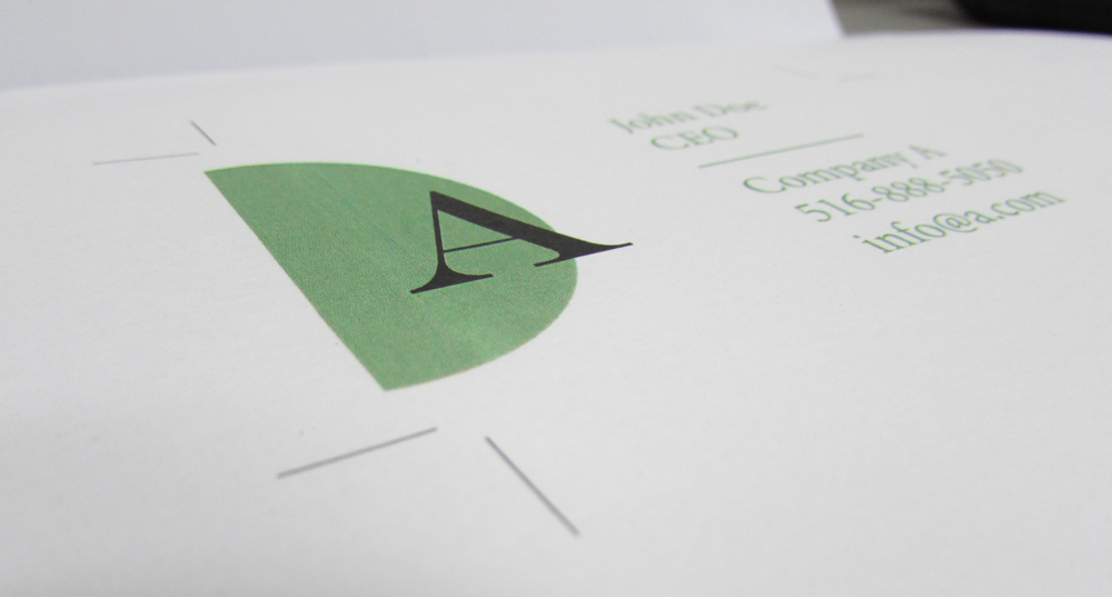
After a lot of head-scratching, pixel-pushing, and consideration, your new brochures or business cards are finally ready to fly to the print shop.

But, wait!

The worst feeling in the world is to get an item back from the print shop and see that it’s cropped strangely, the colors are out of whack, or there’s a glaring typo staring back at you.

So, let’s talk about five things you should check before you hit send on that file.

One More Proofread for the Road

Proofread Your Print Files

On your screen, moments after completing a design is the worst time to check for errors. Your brain is still filling in the gaps and seeing what it thinks it should see, not what is there.

If time allows, walk away from your design for at least an hour. You’ll want to look at it with fresh eyes.

Then, go ahead and print it to scale. Take a critical look at it both at close and, if it is larger than a business card, a few steps back.

Look for images that are out of alignment, text that doesn’t fit quite right, and of course, typos! Check every address, phone number, and email address for accuracy. If time allows, pass it on to a co-worker to perform the same check.

Verify your Color Space

Verify Your Color Space

The RGB (red, green, blue) color space is commonly used for digital pictures, like monitors and TVs. It is the color space you’re viewing this article in. By default, most graphic programs like Photoshop will start you in an RGB color space, as it anticipates that the files created will be used for the web.

CMYK (cyan, magenta, yellow, black) is used for commercial printing. In general, when you create a file for print at a print shop, you’ll want to ensure you’re working in the CMYK colorspace. When you first set up the file, you can easily define this by selecting the print presets.

As digital printing has become more common, things have changed and yet, CMYK is still the preferred colorspace for printing.
So, before you hit send, give your print shop a call and ask them which color space they use. This simple tweak can save your new brochure or flyer from coming off the press looking a little off color-wise.

Check your Bleed Settings

Check your Bleed Settings for Best Printing Results

Bleeds are important for any document that is printed edge-to-edge, where the solid colors or images need to go all the way to the edge of the page.

While you’re on the phone with the print shop, verify what they’d like the bleed settings to be. We prefer ⅛” bleeds, but some may ask for ¼” or ½” bleeds to give themselves a little more margin for error.

Take a look at your file in your graphics program. Make sure that all your artwork is extended past the bleed line. Also, ensure that all text and important graphics are within the safe zone which is typically a ¼” from the edge.

Some print shops can provide a bleed and margin template, but if they cannot, just create a margin guide about ¼” from the edge of your document and let no important text or graphics past it. This will prevent any important information to be cut off.

Embed or Flatten your Fonts

You spent so much time designing the perfect document and a big part of that is font selection. To ensure that your fonts print properly, you’ll want to embed them into the file. Fonts are pulled from your local computer, so there’s no way to know if your print shop will have the same font.

First, keep a backup of your file with the text still editable. Then, go into your document rasterize each text layer if you’re using Photoshop. If you’re using Illustrator, convert each text element to outlines.

If you’re sending your file as a PDF (and you should be), you can sometimes embed your font directly into the file. This will make your file size bigger but allow the recipient to edit the text if needed.

Some fonts don’t allow you to share them in this way, so it isn’t always an option. Sometimes, all you can do is rasterize or outline them.

Convert your File to PDF

Illustrator, Photoshop, and InDesign files don’t email well in their native formats. They often contain fonts and images that are linked to files on your local computer. When the printer opens these files, they won’t see what you see! Missing fonts, images are only the beginning though. Some files can render differently on different machines (especially if the file was made in a Microsoft Office product like Word, PowerPoint, or Publisher).

So, if you’re sending a file to a print shop, convert it to PDF. If your file has bleeds, be sure to check that the bleed settings are turned on as you export the file. A PDF is a special kind of file that will retain the visual formatting of your file consistently on any machine that opens it. It’s a graphic designer’s best friend.

With these five tips, you’re on your way to having picture perfect files every time. If you’re ever unsure of any settings or requirements, don’t hesitate to call your print shop. We love speaking to our customers and want to make sure your file is formatted properly, so you get great print results from our service every time.

If you have questions or need a quote for your next printing job, leave a comment or give us a call at 877-MMPRINT!

Any tips you want to share from experience?

Barcode Printing

Barcode Printing Basics

Barcodes are just about everywhere these days. They make our life a lot more simple than we realize. Factories use them to control production. Shippers like USPS, UPS, and Fedex use them to track packages and monitor the flow of shipments. You can find them on government issued ID and at your local(or not so local) grocery store. Barcode printing is fairly simple, provided that the design is correct. But, let’s take a step back and find out what our black & white friends are all about.

Most people will recognize the UPC barcode below. It is most commonly found in retail stores.UPC Code

A barcode is simply a symbol that contains information, which, is read by a machine, which, is usually connected to a database.  They fall into 2 main categories, each of which has its own variations. A UPC code like the one above is a one dimensional barcode as it only takes advantage of the thickness of the bars and the spaces in between them.  Another example of a one dimensional code is something used by UPS or Fedex.

Here we have a QR code.QR Code This is an example of a two dimensional barcode. It takes advantage of the horizontal and vertical spacing. Originally created by vehicle manufacturers for production purposes, they are widely used today by mobile phone users for discounts or purchases. QR codes can also be placed on printed objects like posters or magazines and read by a mobile phone. This will open the phone’s web browser and take the user to a specific site or page. This is called a hardlink.

Why is this important to me?

Firstly, we chose the above codes because they are 2 major players in barcode printing. QR codes, while fairly new to some, have excellent benefits for consumers and businesses alike.  QR codes can also be generated easily and have given small businesses exposure they would not otherwise enjoy.

Companies like Amazon are giving UPC codes to new business owners and inventors. This allows someone who developed a gizmo in their garage to harness the power of a giant like Amazon and expose their products to millions of people, who would have been out of reach before.

Barcode printing

The first rule of barcode printing for a small business is to make sure your barcode is accurately adapted into your overall design. That, and well if it is possible, test it beforehand. A printing company can only accurately recreate what you need. But, whatever you give them to work with is ultimately what will come out the other side.

If your code is not active with vendors, suppliers or linked to the web, it won’t matter how perfect a job is done, it will not work. As we mentioned before, barcodes contain data, which, is linked with a database. So, if that database does not recognize the information stored within the barcode, or if the link on a QR is dead, well, you get the point. Another major point is that the quiet zone around the barcode should be no less than 1/4 inch. The quiet zone is a buffer that prevents a barcode reader from picking up any irrelevant data.

The good news is, there is a world of potential with these codes. Barcode printing is becoming more and more common and is an excellent marketing tool. Companies like ours have experience in barcode printing and can give you some pointers. Some companies also have a scanner lying arund and can try and test the finished product(only test, read the above paragraph). Choosing the right company is paramount, as we can help you avoid some of the pitfalls of printing barcodes. It is still important to note, however, that one must stay within the guidelines of what is set for that code. A lot of companies will tell you what size it can and cannot be and how much quiet space there should be. QR code generators will give you parameters as well.

Color QR Code with Logo

Benefits

QR Codes can also be enhanced to incorporate your logo and include color. This provides an excellent marketing opportunity for many small business. There is a segment of the population, though, that is still unfamiliar with QR codes. Still, many people have a phone on them that can scan QR codes easily.

Dynamic QR Codes can also have their information altered so that, you can use the same QR code but can alter the end result.

The potential for small businesses to use these codes to their benefit is growing daily. You can read more about it from a previous blog. Large corporations like Dunkin Donuts, Target, and Amazon use them to attract new customers and create calls to action. Small businesses can do the same, increase brand awareness, and attract customers in many ways.

All barcodes to need to be printed at some point. That is where an experience printing company can help. A restaurant can send an EDDM flyer with a QR code for 10% off. Or put a code in your brochure for special offers.  The options are endless.

Choose a company that has experience in barcode printing. Make sure your specification are accurate, then use your own ideas, our ideas here or from our previous blog on how to help increase your revenue. 


Choosing the Right Poster or Sign Material: Getting the Most Out of Going Big

There is so much planning that goes into an event, that it can be difficult to get detail just right. Choosing the right location, inviting the right people, coordinating the speakers or activities – usually the last thing on your mind will be what materials to use for your signs and posters. This can be an important factor though when deciding where a poster will go, how long it will stay up and how you plan on displaying it. There are several different materials that posters and signs can be printed on and they all have different strong points:

Indoor vs Outdoor

The first question that should be answered is “will the sign be used indoors or outdoors?” Some materials are more durable and will stand up to elements like rain, wind and UV rays from the sun. Luckily we can print signs using UV safe inks to avoid fading and discoloration.

Outdoor Signs

When creating outdoor signs, you will usually want to print on plastic materials as opposed to paper based substrates. Materials such as Coroplast (corrugated plastic), vinyl and Sintra board (rigid PVC) are better options for outdoor use because they are water resistant. Vinyl banners will not easily rip, and Sintra and Coroplast are rigid so they will not bend or crease easily. Printing on metal is also a good option for a long lasting sign.

cut out sintra board signs | mmprint.com

Indoor Posters

For posters and signs that are going to be used primarily indoors, there are more lightweight and affordable options. You will not always need a rigid sign and instead can use a paper poster that can easily be rolled up and transported. Paper posters are also easy to mount using clips, magnets, tape, adhesives, tacks and more.

Foam board posters are also a great choice for creating a prominent display. The thick canvas makes the image protrude off the wall which adds some dimension and draws attention. Foam board is also easy to stand on easels and displays without falling over.

paper posters basketball players | mmprint.com

Grommets

You should also know whether or not you will need grommets installed on your sign. Grommets are small metal rings that are placed in the corners of a sign or banner so that they can be easily hung using string or rope. Grommets can be installed on almost any type of poster or sign.

Silver grommets used for hanging posters, signs and banners | mmprint.com
goldstartool.com

Banner Stands

Another simple solution for transporting larger banners is to use banner frames or retractable stands. Popular styles of this are step and repeat banners which usually take a logo or image and repeat it across the canvas. These are commonly used for runways and photo shoots, but have recently become popular as a fun prop for weddings, birthdays, company parties and other special occasions. They usually come 8′ x 8′ or 8′ x 10′ and can be easily assembled at any function.

step and repeat banner printed 8x10 and used for runway shoots | mmprint.com

Retractable banners are another great option when signs need to be easily installed or moved around during an event. The vinyl or fabric banner rolls into the stand and can contract to a small, portable package. The most common size for retractable banner stands is 33″ x 78″ which makes them visible on college campuses, trade shows and retail stores.

portioned retractable banners for a health organization | mmprint.com

Now that you have a better idea of what type of poster or sign you will be printing, it’s time to get designing! Check out our graphic design templates or head over to our website to get a quote on your project!

Have further questions? Leave a comment below and we can help you decide the best option for your poster or sign.

3 Steps to Self-Publishing your Custom Coloring Book

There are many ways people can distract themselves from their daily lives and place themselves into an alternate world of serenity that is distraction and problem free. Most commonly these are channels such as television, music, novels – and more recently, coloring books. In fact, adult coloring books have become so popular in recent years that the increased demand has actually created a shortage of colored pencils in some countries. This medium of relaxation has proven to not only be dedicated to children anymore.

There is a reason for this spike in popularity with adult coloring books – they are a fun, easy and inexpensive way to reduce stress and escape from daily aggravations. Some psychologists even recommend using coloring books as a de-stressor, citing that “the action involves both logic, by which we color forms, and creativity, when mixing and matching colors. This incorporates the areas of the cerebral cortex involved in vision and fine motor skills [coordination necessary to make small, precise movements]. The relaxation that it provides lowers the activity of the amygdala, a basic part of our brain involved in controlling emotion that is affected by stress.”

This form of structured creativity allows people to easily get in touch with their creative side. It can also be a collaborative experience for both an artist and their audience. Letting your audience finish coloring in your drawings can lead to an endless number of unique artistic variations. It is easier than ever to self publish your own coloring book, and to get your drawings in the hands of friends, family and fans. Here’s some quick tips for getting started with producing your own coloring books from sketches and drawings.

  1. Setting up your Drawings

    So you’ve created some beautiful illustrations, and now you’re ready to turn them into a book. The next step would be to make your drawings into digital files so that they can be reproduced for your book. There are a few ways to do this, the most popular being to scan or photograph the drawings. Many print shops will have large scanners that can import your drawings at 300 DPI (Dots Per Inch) resolution.

    Digital cameras have improved so much in quality that the resolution of a photographed drawing will often surpass that of a scan. The photograph may need to be cropped, straightened or color corrected, but will definitely work if a high resolution scanner is not available.

    Coloring Book and set of colored pencils on table |mmprint.com

  2. Choosing the Right Paper for your Coloring Book

    Some types of paper work better for different types of coloring books. There are two main styles of paper – coated and uncoated. Coated paper comes in either gloss or matte finish and should be used when you are expecting people to use colored markers or highlighters fill in your drawings.

    Uncoated Offset Paper is what is used more traditionally for coloring books. This opaque white paper is perfect for coloring in with crayons and colored pencils. It usually comes in different weights, such as 60lb, 70lb, or 80lb as well as variations of white, bright white, natural white or ivory.

    The cover of your book is also something to consider. Even if the inside pages are uncoated, a gloss cover can make the images and colors on the cover pop.

  3. Creating your PDF for Print

    When getting ready to print, you will need to supply your printer with a press ready PDF. This means that if your drawings extend to the edge of the paper, you will have to design an extra 1/8″ so that there is no accidental white space on the edge of the paper, and no valuable content accidentally gets cut off.

    When submitting your PDF, most printers prefer a PDF with individual pages setup in the order you want them printed.

    For more about design with bleed, check our InDesign Tutorial on how to properly set up your document.

Printing a Unique Restaurant Menu That Will Last | Lamination vs. Synthetic Menus

When ordering new menus for your restaurant, you want to make sure you are getting something that not only looks great, but will also last a long time. Since the menus are constantly around customers, water and heat, ordinary coated paper will not do the trick. There are a few ways around this, and the finishing can dictate the overall design of your menu. The most Common of these options are Edge Sealed Lamination, Flush Cut Lamination or Synthetic Menus.

After designing your menu to look exactly how you want, use the information below to help decide what type of finishing will work best for you:

Lamination

After your menu is printed, you can choose to add a layer of lamination to protect it. The Lamination process involves taking your printed sheet and rolling it between two layers of lamination. The packet is then heated to bond the lamination together and seal in the menu, creating an air-tight protection. Our lamination comes in two thicknesses: either 10 mil (5 mil per side) or lighter 6 mil (3 mil per side). A mil is equal to 1/1000 of an inch (0.0254 mm).

After the menus are sealed, they go into the cutting stage. There are two ways that menus can be cut:

Flush Cut Lamination

Flush Cut Laminated Restaurant Menu Books | mmprint.com
Flush Cut Laminated Restaurant Menu Books

Flush cut finishing is when the menu is cut along the edge of the menu. This gives the menu a clean-cut look because there is no lamination hanging off of the edge of the paper. Because it cuts slightly into the menu, the edge will be exposed. This can result in water seeping into the edges, and the lamination starting to peel off the paper.

Flush cut is a good option for a restaurant that is looking for aesthetics over durability. It is also more cost effective, and could be a better option if the menu is replaced somewhat frequently.

Edge Sealed Lamination

Edge Sealed Lamination Menu Books | mmprint.com
Edge Sealed Lamination Menu Books

Edge Sealed Menus are the most durable option we offer for menu printing. After the sheets are laminated, they are then hand trimmed, leaving a border of plastic around the page. This ensures that the menu stays completely enclosed, making it absolutely waterproof. The plastic border that remains is usually between a 1/16″-1/8″.

Edge Sealed Finishing is the best option for restaurant menus that are constantly being handled by customers and servers or exposed to kitchen elements. Since they are hand trimmed as opposed to machine cut, they tend to be more expensive than Flush Cut menus.

Synthetic Menu Prints

Synthetic Trifold Restaurant Menu | Waterproof & Tearproof Menu | mmprint.com
Synthetic Trifold Restaurant Menu

Synthetic Menus are a bit different than laminated menus. Instead of the plastic going on top of the paper, these menus are actually made out of a plastic material. Synthetic looks and feels similar to regular paper, but has the unique qualities of being tear-proof and water-proof. Since there is no extra layer of plastic, synthetic menus are thinner and more flexible. They do range in thickness though, from paper weight to cardstock weight.

Synthetic menus are most commonly used as trifolds since they are lightweight. When they are used for spiral bound menu books, they tend to be a bit flimsy compared to the rigid laminated version.

Although the synthetic paper itself is water-proof and tear-proof, the paper and ink is still exposed to the elements. It can withstand being wiped off or sitting in water, but is not guaranteed against chemicals or creasing. Although it is a great option for menus, it is no substitute for durability of a laminated menu.


Need a quote on Durable Restaurant Menus? Head over to mmprint.com to get free pricing, turnaround time and design tips. We’d be happy to any questions you might have!

5 Interesting Ideas for your Custom 2016 Calendar

With the new year creeping up fast, it’s about that time to start thinking about your new calendar for 2016. With so many different options out there, it’s hard to narrow down exactly what kind of calendar to go with. Sometimes if you are ordering a large quantity, it may be worth it to go with a custom designed calendar for your office, team, organization or school. Everyone will love having a personalized calendar, and you have the freedom to make yours look and say whatever fits your project best.

The next tricky part is to pick the type and layout of your calendar. The standard size is 11″ x 8.5″ but there are plenty of other options you can choose to customize your calendar. Take a look at some of the following examples to spark your creativity for your 2016 calendar!

12″ x 12″ Square Calendars

These prominent wall calendars are perfect to display in conference rooms, large offices or anywhere that could use extra large pages. These look really nice wire-bound which is also a plus because they can lay flat if notes need to be made or events added.

12x12-calendars

Small 8″ x 8″ Calendars

We recently had a customer print their watercolor artwork on a smaller version of a wall calendar. These are perfect for cubicles or small desks that don’t have a ton of space to hang full sized calendars.

8x8calendar

Die-Cut Calendars

If you want something that really stands out, consider what Land Rover did with this custom die-cut design. They created a topographic map that could be peeled off day by day, mimicking layers of the earth. A calendar like this is so successful because it pairs functionality with brand accentuation. A calendar like this would be different for every company, but could serve as a great marketing tool.

MTI5MDAzOTUzNjUxNDYwNzM5

MTI5MDAzOTUyMzA5MTE1MzU4


Visualized Calendars

There is nothing says that says the days of the year have to be printed on paper. Visualized Calendars are a creative concept that can take on many different shapes and forms. Look for other media that can represent your calendar – it will attract more attention than a traditional day counter and can draw more notice to your brand. The calendar below uses a rack-and-pinion-like system that can easily be rolled to represent each day of the month.

visualized calendar


Full Spread Calendars

Most monthly spreads are set up to have a large picture at the top, and then a grid at the bottom representing all of the days of that month. This is used to write notes and add events to certain dates. In the digital age however, less people use physical calendars to schedule their lives. Instead, they will use their smartphones to plan their days and keep them better connected.

full page calendar

This doesn’t make the calendar obsolete though. The example above is a repurposed calendar that puts the focus on the artwork. Instead of splitting each page spread into two sections, they extended their artwork the length of the page and incorporated the calendar into the artwork. This design does not leave much room for someone to write on the display, but that is not always necessary. Instead, this layout plays to the aesthetic strength of the design.


Feel free to share your 2016 calendar ideas in the comments below, or head over to mmprint.com to get a quote for your calendar printing!

Crops, Bleeds and Margins: a Brief Walkthrough for Designers

IMG_0933

Crops, Bleeds and Margins are three of the most important factors in setting up a design for print, but often go overlooked. These elements basically ensure that all images and text that extend to the edge of the page are not cut off, and that there are no white borders around the page from where it is cut.

Practically all of our print jobs are printed on sheets that are larger than the finished size, and then cut down to the actual size. This is what we call bleeds and allows for images and colors to be printed to the very edge of a page.

Crop marks are another very helpful piece to include in a design. These basically point to where the actual file will be cut. This tells the printer where to cut, and how much of the bleed to cut off.

Lastly, there are margins which define the live space of a printed piece. This area is a box inside of the page that is usually an 1/4″ from the edge of the page all around. The margins provide a safe area where all text and images should be so that they are not accidentally trimmed.

The best way to understand crops, bleeds and margins is to see it visually. Check out the video below that goes over all three elements and explains how to save a PDF properly for print:

Standard letter page in Adobe InDesign:

Business Card Setup in Adobe Illustrator:

You can read more in depth guides about designing for print in our info center or get a quote for your next print job at mmprint.com!

Useful Pointers for Creating an Attractive Header Card

When shoppers are browsing a store, they are often walking past hundreds of different products and brands trying to grab their attention. A product’s packaging can be one of the most important factors in a customer’s buying decision. Having a poorly designed package can give the impression your merchandise is cheap or inferior. Make sure your packaging boosts your brand image instead of hurting it.

There are many different ways to package your goods, but one of the easiest and most cost effective is the use of header cards (also commonly called bag toppers). This packaging consists of a printed piece of cardstock folded in half and stapled to a polybag. This simple packaging process will get your products on the shelf in no time!

Custom header card printing

Choosing a Header Card Size

Many printing companies offer a few sizes for header cards, and some will be open to printing any custom sizes. When choosing your size, make sure the width of your header card is at least an 1/8th” longer than the width of your polybag. As for the height, it is more of a personal preference, but generally a heavier product will have a longer header card.

Designing your Bag Topper

Having a skilled graphic designer create the artwork for your packaging is another important aspect for making your product stand out. When designing for print, there are a couple of important points to remember, such as designing with bleed so that you don’t have white margins around your card.

When designing your card, remember that the design will be printed on one sheet of paper that is folded, so you will need the top half to appear upside down.

Here are some design templates for a common size header card:

Templates
5″ x 4″ (5″ x 2″ Folded) – InDesign or PDF

Header cards can be designed on both the front and back. It could be useful to print instructions or additional information on the inside of the card to keep it hidden.

Choosing a Hole Punch

For Bag Toppers, there are two standard options when it comes to hole punching: the standard hole punch or the sombrero punch (pictured below).

Sombrero punch header cards

Some smaller products may be better suited without a poly bag. For this type of packaging, consider printing your design on a thicker cardstock with slits to attach your product to. This is a great option for jewelry and other small items.

Looking for expert advice on variable data printing or need a custom quote? Feel free to reach out in the comments section or visit our header card printing page!

The Basics of Designing and Self-Publishing Your Independent Comic Book

Among the likes of many types of popular media such as music, films, and literature; comic books have gone through different eras and styles over the years. Just as popular music cycles through different genres, comics have gone through different styles of narratives and illustrations to coincide with current events and pop culture, which may make it difficult when deciding how to design your independent comic book or graphic novel for print.

For example, the Golden Age (pre-1950s) of comic book publishing focused on the idealistic hero, who combated whatever evils were plaguing the world at that moment. The Silver Age (late 1950s-1970s) incorporated advancements in science and modern inventions into the stories and the hero’s characteristics. This was followed by periods tackling social issues (Bronze Age) and turning away from the traditional hero (Modern Age).

Display of Comic Books from older time periods

Series of Silver and Gold Age Comics – Source: Ryan Brunsvold


Throughout this whole transition there has been a resurgence of comics in recent years being re-imagined into other media such as television and movies (see The Walking Dead and Guardians of the Galaxy). Examples like this may be correlated with the spike in interest in comics and. This coupled with the fact that computer-based design programs have made it easier to set up and create beautiful illustrations and animations allows amateur artists and independent comic publishers to create their own comics and make them look professional grade.

However, even with a modern hero and a striking design, a comic book is not complete without a proper printing job. For your comic book to seem legitimate and get noticed, it would be best to have them professionally printed so that they have proper color matching, bleeds to cover the whole page surface, and correct alignment between full page spreads. Luckily, we offer affordable pricing for comic printing, and expert advice and design tips.

Four important factors to consider when designing your independent comic book

comics-blog

  1. The standard size of a comic book

Just as the themes of comics have changed over the years, so have the traditional size of the pages. Although the first comics were printed about an inch wider than they are today, they have standardized over the years. Today, the traditional size of a comic book is 6.625” x 10.25”, but comics can also be printed in custom sizes. Graphic novels on the other hand don’t have a standard size, but common sizes include 5.5” x 8.5” or 6” x 9”.

  1. Choosing the right style of paper for your comic

Do you want your comic to be glossy and shiny? Or how about flat and subtle? Your printer will be able to help choose the right paper stock for your project and can provide printed samples for you to compare. Typically if you want the comic to have a shine to it, you will be printing on gloss or matte coated stock. Gloss coated will be brighter than matte, but matte will still have some reflective quality.

Uncoated paper on the other hand will have a flat, natural look and is more commonly used for printing comic books. It is also common to print on uncoated inside pages, with a gloss cover.

Important Note: Check with your printer to see if they will be printing digitally with toner, or on an offset press. Toner naturally causes the printed ink to shine, so even if a comic is printed on uncoated paper, it may still appear glossy. An offset press will leave virtually no shine.


  1. The weight of your paper

You should also decide how heavy or thick you want your paper to be. We prefer to print comics on 60lb or 70lb uncoated text stock to give them a weight that’s sturdy enough to last through multiple reads, but not too heavy to be cumbersome. This thickness also prevents dark colors from showing on the reverse side of a page. If you are unfamiliar with different weights of paper, consider that standard copy paper used in your home printer is normally 20-24lb.

In printing terms, a plus-cover booklet is when the cover is a thicker stock than the inside pages and a self-cover is when the cover stock is the same as the inside. So you can also consider having a thick glossy cover, with thinner uncoated pages on the inside.


  1. Choosing your binding

Almost always, a comic book will be saddle stitched; meaning large sheets of paper are folded in half and stapled to the correct finished page size. This is a cost efficient option, and creates a lightweight and easy to store comic. Graphic novels on the other hand may be better suited as perfect bound books to give them more of a traditional “book” feel.


Any additional questions about comic book printing and specific features available should be discussed with your preferred printer. There are several additional options which can make your comics stand out such as spot UV coating.


Avoid Issues By Saving Your Artwork Properly In InDesign For Printing

There are a few simple rules to follow when saving a print-ready design made with InDesign and it all starts with setting up your InDesign document properly with bleeds.

 The following paragraphs will enlighten you to a few golden rules to follow when it comes to saving/exporting your design to make sure it’s ready to go to print. 

The Need To Bleed

Adding bleeds from the start, BEFORE YOU EVEN START, is crucial. Think about it, you’re working on a 200+ page catalog and then you find out you have to go back and extend the bleed of every single object in every single page!! I really think if that happened to me I’d be Keanu-level bummed…

Should Have Added Bleeds Keanu

Packaging vs. Exporting

There are two common options when sending your file to your favorite printing company. You can choose your preferred route, although one is easier and produces a smaller file size:

1. Export to PDF

You can easily export your file to PDF format and send one single PDF to your printing company.  Saving as PDF embeds all your fonts and linked images into one file; nowadays this is the preferred method.

2. Package…

Packaging all of your document fonts, linked images, instructions and native InDesign file is another option you can exercise when sending your files to print. This option does create a pretty large file size that might make it a little harder to transfer to your printer vs. a PDF that could be half the size.


Save It Right The First Time

To save your InDesign file as PDF:

  • Click  File > Export  .
  • Enter your filename
  • Click Save
  • Select the [Press Quality] Preset

InDesign Export To PDF - Press Quality

Compression

I recommend leaving the compression to default values. For printing you only need 300 DPI images. If any of the images in your document are above 450 DPI, InDesign will automatically downsample the image to 300 DPI to reduce file size.

Color Image Compression:

InDesign Monochrome Image Compression Settings

Grayscale Image Compression:

InDesign Grayscale Image Compression Settings

Monochrome Image Compression:

InDesign Monochrome Image Compression Settings

Marks and Bleeds

To be safe, you can always simply select “All Printer’s Marks” although the most important options to have selected here are Crop Marks and Bleed Marks. Crop and Bleed Marks usually go together when any of the art, anything being printed, reaches the edge of the paper. A crop mark denotes where the paper will be cut to the final size while a bleed ensures that a white border is not present at the edge of the paper when cut.

Learn more about Crop Marks, Bleed Marks and the Cutting Process in printing.

Marks

InDesign Marks and Bleeds Settings

Bleeds and Slugs

If you set up your document correctly before starting your design as I stated at the beginning of this post, then it’s safe to select “Use Document Bleed Settings”. The slug is primarily to be used by you during design so we’ll just leave that unchecked.

InDesign Bleed and Slug Settings

Output

The default settings found in the Output options are pretty general and apply pretty well in all situations within the U.S.
Check with your printer first since it is possible that they have a preferred profile that works best with them. Otherwise, leave it as is – CMYK – U.S. Web Coated (SWOP) V2.

InDesign Output Settings


This is box title
Time for you to contact a modern printing company who will be able to use your PDF when saved with these settings. Honestly, you need to look no further as you are already in the right place: The Marsid M&M Group offers both digital printing and offset printing, foil stamping and embossing, custom die cutting and mailing services all with fast turnaround, all done in-house.

 Give us a call at 1877-mmprint or visit our website www.mmprint.com