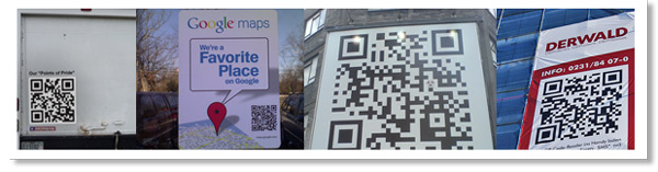
Your Photos on Canvas – Like Hiring a Professional Painter

Photos on Canvas

Canvas Poster PrintingPhotographs are part of our lives and history. Many of our life’s anecdotes and achievements are captured to bring us back to these moments, share them with others, and rejoice with the memories.

A great way to immortalize these beautiful moments from the past is printing them on wonderful, sturdy, framed canvases. A canvas photo given to the right person can make a very touching gift, and can also add beauty and character to a room of the house.

Choose that special photo and make it even grander by having it printed on canvas.

Canvas Substrate Texture

No second thoughts, second chances

Even if your photos have suffered the weight of time and appear damaged, a graphic designer can take your old, worn pictures and clean them up with graphic design software such as Photoshop. The restoration process will awe you and surpass your expectations. Picture cropping, background changes, cleanups of minor flaws, and more. Not happy with the color? The color can be enhanced , modify the color, and even switch the whole image to sepia or black and white to fit the mood you desire. Once the image is ready to be printed, it can go in various canvas sizes, and finished with beautiful frames of your choice.

If you feel creative, you can arrange a number of your photos into one single collage.

Don’t shy away! Do you have any ideas we have not described? Discuss your preferences, ideas, and questions Below.

QR Code – The Advertising Double Agent

QR Code
Scan me!

QR Codes (Quick Response Codes) are the connection between online and offline marketing. With the advancement and acceleration of smart phones, consumers have the ability to scan and interpret this barcode with their mobile phone. Originally created by a subsidiary of Toyota, Denso-Wave, the QR Code technology has been around for over a decade.

Versatility is QR Code’s middle name.

The amount of data that a QR Code can hold is approximately 7089 Numeric characters or 4296 Alphanumeric characters as stated on Wikipedia.

This allows for the encoding of URLs, phone numbers, full contact information, SMS messages, links to launch YouTube videos, display static text… to name a few options offered by this revolutionary technology.

How Can Advertisers Use QR CODES in Printed Materials?

QR Codes in Advertising

Believe it or not, your entire marketing piece can be designed around a QR code.

Want to inform your customers of a GRAND OPENING? Create a Google Places Page which provides you with a pre-made QR Code that contains a link to your Google Places Page, Your customers can scan the code and visit your Google Places Page on their mobile phone. Once there, your customer will find all there is to know about your business and directions to your location. Scan the QR Code above and see for yourself!

Do you have a  product demonstration video? Include a QR Code in your postcard, brochure or even next to the product in your catalog that will direct the customer to view a product demonstration video on their mobile device. This also gives you the chance to direct the customer to a landing page on your website before or after the video is viewed, reinforcing the sale.

Want to make it easier for that potential customer to retain your contact information? Generate a QR Code that contains all of your contact information and include it on your business card. When a customer scans your QR Code with their mobile device, depending on the QR Code Reader they are using (see “QR Code Readers” below), your contact information will be displayed and saved to the “contacts” or phone book of the mobile device.

Depending on your product or service, QR Codes can serve a variety of customizable uses in your marketing scheme.

Business card with QR Code

Where can Custom QR Codes be Generated?

We must be thankful (to Denso-Wave) for the use of QR Codes being free of any license. This has given developers the ability to create online QR Code generators…FREE TO USE! Of course you will find some out there that want to charge to use their generator or allow for Non-Commercial use only, but here is a list I compiled to help you get started generating QR Codes and better yet… more sales conversions!

  • beQRious – Extensive Options – Featured: QR Code with Embedded Image
  • ZXing Project – Extensive Options – Featured: Wi-fi Login Information
  • QRStuff – Extensive Options – Featured: Google Maps Directions
  • Delivr – Extensive Options – Featured: URL shortening
  • Mobile-Barcodes – Extensive Options – Featured: Email Composer
  • Mofuse – Simple Generator – Featured: Generates Hosted Image Link
Here are some helpful links to download QR Code readers for your smart phone:

View this article via your mobile phone to download and install directly to your mobile device.

I-nigma – I use this one myself.

Scanlife

NeoReader

How have you used QR Codes in your marketing?

Colorful Collection of Poster Designs for Inspiration

Poster by CPX InteractiveWhen promoting a band, a new product, service or simply to convey information, a full color poster will STAND OUT like capital letters in any text message.

Posters are designed to be hung on walls and many other large flat surfaces. Their large format allow for both text and images to promote events, use as an informational guide and can even be educational.

Posters can be printed on many different substrates.  To name a few: vinyl for durability, art canvas to give it an “artsy” finish or even acetate for more creative works. Posters can even be mounted on different materials or framed. Foamcore and Gatorboard are frequently used and allow for the poster to stand on its own or be displayed on an easel.

Here is a collection of beautiful and colorful posters that will hopefully strike a spark in your brain and ignite a creative fire that will make your next poster design STAND OUT beyond it’s size…

Poster by Beaucoupzero

Poster by Ellyezer

Poster by Etrix

K-Salaam and Beatnick Poster

Poster by MrHahn98

Bauhaus Poster by DT1087

Poster by StrongstuffPoster by Aremanvin

Poster by Zivrezcara

Poster by C345

BLACKOUT_POSTER_by_Demen1

[box title=”Word To The Wise” color=”#333333″]Get Inspired, Design Something Amazing and Have it Professionally Printed. Call us 516-334-1603[/box]

Design a Winning Business Letterhead

Full Color Business LetterheadBusiness letterheads not only reflect what your company does or what it is, but it reflects the type of customers you serve. Make your customers feel at home each time they open correspondence from you. Help them remember who you are and what your purpose in their lives is. A good letterhead carries more than just your company’s information; it carries character and the type of familiarity that makes your clients feel at ease when doing business with you.

Print your business letterheads in full color to reinforce your brand and marketing message. You can add different features, such as a simulated custom watermark, a design for the back side, or anything you can think of.
Invoices, receipts, or any formal correspondence should always be printed on company letterheads. Your customers will notice and appreciate the difference and convenience this brings them when archiving, sorting, or preparing business reports.

Make sure your logo dresses up your stationery with vivid, bright colors.

Letterhead Business Information Placement

Here is some information to keep handy while constructing your business letterhead design:

Your logo and basic contact information should always be part of your letterhead. Keep the background subtle and sober, you do not want to distract the reader from the information provided in the body of the letter.

Letterhead-business clean design

Divide and Conquer

You may divide the information in two parts; header (at the top) and footer (at the bottom), this allows more space in the body of the document for the content of your letter. The header should consist of your logo, company colors, and basic contact information. The footer usually contains more formal copyright, business entity, and disclaimers. Include company colors in the footer as well. A hairline bar, separating the footer from the body content, for instance, can tie the brand together across the page.

Size it Up…or Down

Make sure your font does not go below 8, or it would be incredibly difficult to read, on the other hand, make sure it is not so big that it makes the content look cluttered and unrefined. Look at your page as a whole, and determine whether the relationship of the sizes (logo, font, lines) is smooth and appealing.

Backdrop or Watermark

It is interesting to have something in the background of your letterhead, it could be your logo in a 10% tint or an image representing your product or service. However, all with moderation. The background should not be the most visible part of your letterhead, and should definitely not upstage the content of your letter, or even worse, make it unreadable.

Letterhead Design with Watermark

Background

Beautiful business letterheads are printed on uncoated paper for ink-jet printing and ballpoint pen writing ease; the industry standard. There are many premium stocks available that include textured finishes to give your letterhead that extra oomph of professionalism.

Business Letterhead Paper Stock Options

For inspiration, below are a few letterhead designs that stand out above the rest:

Business Letterhead by Diversionary

Business Letterhead by ChasedbySilence

Business Letterhead by Kiq

Business Letterhead by Silverspoon102

Are there any business letterhead designs that you would like to share?

Please share your comments with us below………

12 Months of Continuous Daily Advertising – Custom Calendar Printing

[note color=”#FFCC00″]

September Savings! – Buy 10 Calendars – Get One Free

You heard it right! For every 10 Custom Calendars that you order, we will print an extra one for free. Use Code STB13CL when requesting your quote or give us a call now at 1-877-mmprint! [/note]

Custom Calendar Printing Custom printed calendars can be an invaluable asset to your marketing strategy.
When designed properly and made useful, a calendar is a guaranteed 12 months of daily advertising that you pay for only once. No pay-per-click, pay-per-view or pay-per-anything! Have your full color calendars printed all at once, distribute them to your customers – be it new prospects or loyal customers – and that is it. Do you have a graphic designer in-house? If so, the only costs you incur for 12 months of daily advertising is printing and distribution.

Advantages of Custom Printed Calendars

Custom Calendars for BusinessA standard calendar is generally composed of 24 inside pages and a cover. Seven 11″ x 17″ sheets are folded to 8.5 x 11 and saddle stitched (stapled). This is the most basic of calendars and includes small variations in paper thickness. There are many types and layouts for printed calendars all having either a standard or versatile use. Assign a specific product to each month, provide monthly coupons, display specific information that relates to your product or service for that month, or you can utilize images provided by your customers. A custom calendar can be used as a catalog, informative brochure or handy tool for your customers.

Calendar Sightings

Calendars can be found just about anywhere. Offices, homes, home-offices, gas stations, restaurants, garages, retail stores, the list goes on and on. The key question here is HOW are they used and/or displayed in these different settings. Households for example, typically use them as decoration that changes month to month. Therefore, a calendar made for households should contain beautiful imagery or art. Some businesses use calendars as an organizational tool: Scheduling meetings, staying aware of deadlines, jotting down notes, employee birthdays or days off.  A calendar for a business setting needs to be practical and have room for writing notes.

Custom Desktop Calendar
One great example is the calendar that one of our paper vendors sends us every year. It is a desktop calendar that I keep on my desk throughout the year, it has lots of room for notes, writing down print jobs that are due on a certain date, and just doodling in general . In fewer words, it is extremely convenient.
So what does this do for the vendor? Well, their logo and contact information is always available to me throughout the year. Whenever I am taking sales calls and get a request for a specialty paper, who do you think comes to mind first?

Just the thought of having to go through my boss’s Rolodex to find a vendor’s information……..

Real Rolodex
🙂

“Convenience and Practicality” – Apply this concept when creating a plan for your calendar and the rest will fall into place. Enjoy these charming custom calendar designs and may they influence your design and productivity:

Colle+McVoy: Creative calendar

3M Post-it Calendar

Keskin 2010 Calendar

STIHL Autumn Calendar

Calendars and Beyond

Here at mmprint.com, we decided to “theme” our 2009 calendar with inspirational art and design quotes jazzed up with beautiful stock photos that coincided with the quote and season. We received a colossal amount of positive feedback from customers.
This year we decided to showcase one of our newest products by placing our 2010 calendar on a custom mousepad! We also added a functional ruler to max out our space with usability.
Custom Calendar Printed on a Mousepad

Do you have a custom calendar that you have designed or printed and would like to share?

Please comment below…

Amazing CMYK Inspired Designs


Printers and print designers eat, breathe and sweat CMYK.
One of the most common mistakes made when beginning a print design is to make sure the Mode is set to CMYK.

What better way to embed CMYK mode into your brain to make sure your design is correctly formatted for printing?

A showcase of Incredible Full Color CMYK Posters for reference and inspiration!

CMYK by BlackTSpawN

CMYK by DecadentBlend.com

CMYK by Shanthora

CMYK by Nellmckellar

CMYK by Seba300

CMYK Splatter

Have you had any beginner mistakes or simple “I can’t believe I did that!” mishaps in a design that you would like to share?

Share your must-see CMYK inspired designs too…

Design and Print a Stunning Catalog – Solid Product Promotion

Catalog Printing ServicesCatalog: (n) a book, usually illustrated, containing details of items for sale.

As simple as this definition may sound, the reality is that designing a catalog requires preparation, specification and of course, a little imagination.

The following paragraphs will provide you with a basic idea on how to prepare for your design, specify product descriptions and adding a bit of magic in your design to make your customers want to continue browsing thorough every single product you have.

Before you begin

  • It is important to pay attention to the smallest details when creating a printed catalog.
  • All Images need to be high resolution.
  • Headlines and description have to be concise and relevant to the product.
  • The paper and finish you chose will play an important role in the success of your catalog.
  • Make sure to have your final draft proofread a couple of times by different agents in your company; Grammar and/or simple errors can reflect poorly upon your brand.

High Resolution Images for Catalog PrintingHigh Resolution Product Images

“In their splendor, images effect a very simple communion of souls.” – Gaston Bachelard

When presenting your products within a catalog, in essence, you are producing an extension of the physical product for your customer. Therefore, it is of upmost importance to have clear, high resolution, quality photographs and/or clean vector images. The goal is to make a connection between the viewer and the product as if they were holding the product in their hands.

Catalog Design and Printing Compelling Headlines
Compelling Headlines and Informative Descriptions

Concise: (adj) brief in form but comprehensive in scope.

The purpose of a headline is to solicit the reader’s attention, engage his or her interest and finally, entice them to keep reading. Keep it short and to the point. A headline should not be misleading; It should be utilized as a tool for the reader to find what they seek quickly, all the while trying to spark an interest they were unaware of.

The product description is the opportunity given by the headline, to capitalize and make the sale. Depending on the type of products you are promoting,  a description can be a block of text or just bullet points.

Here are a few tips on what a description should include:

  • Physical description: Remember the product image does a great job of this but the conversion lies in the details
  • Manifest the need: Justify the reasons why the customer “needs” your product and the benefits that accompany the purchase
  • Technical Details: Provide sizes, manufacturing materials, quantity, everything relevant to the product
  • Additional details: Include any copy regarding where to find warranty information and how to contact a knowledgeable associate regarding the product
Catalog Spot Varnish Cover
Catalog Cover Spot Varnish

Spice Up the Design and Content with the Appropriate Finish

With so many incredible finishing options available for catalogs, finding a combination that suites your products and design is certainly a crucial step. This choice is best determined once the design has been completed or at least when the design has been planned (except for size and orientation).
Layout, size, colors and budget all play an important roll in this equation.

The following is a list of popular finishes available for your catalogs:
Coating
  • UV Coating – High Gloss
  • Spot UV – High gloss in specific areas of the design
  • Aqueous Coating – Matte (less expensive than Varnish, full coverage only)
  • Varnish – Matte
  • Spot Varnish – Matte in specific areas of the design
Binding
  • Saddle Stitching (Staples)
  • GBC Bound (Comb)
  • Spiral Bound (Plastic Coil)
  • Wire-O (Double-loop Wire)
  • Perfect Bound (Spine Glued to Cover)
Catalog Binding Options
Wire-O – Perfect Bound – Spiral
Catalog Printing Saddle Stitching
Saddle Stitching

Offset and Digital Business Cards – Tips for an Effective Design

Business Card Printing and Design with LogoBusiness cards are more than just portable contact information; Designed properly, they can convey character and utility. When designing your business cards, it is important to consider the end-user.

  • Who will be looking at them? (Design)
  • Who will use them? (Information)
  • How will they store them? (Finish)
  • Will it go into a wallet or be digitally scanned? (Paper Stock)

All of these questions are utterly important to avoid your card being the one that gets disposed of because the information in it did not justify the bulk in the wallet, or because the lack of specificity did not remind customers of what the company does, or even because it is so overly simplistic that it gets lost among other ones. Keep all this in mind and find the right balance for a successful, informative, eye-catching business card worthy of retention.

.
Business Card Design - Simple

The same applies when choosing your printing format

You want to be different, but not so different that confuses your clientele. Again, think whether you are catering to traditional customers who will expect a more traditional font and paper stock, or adventurous individuals who will appreciate your company having taken risks on the size, cut, material, and finishing. People want to identify… help them identify with your company. Going even further, you should consider using double sided cards. You want your business cards to be recognized from every angle, and you want to take advantage of the space. Sometimes it is smart to even include information that can help the customer in their daily lives. A calendar, a time/currency/metric system converter, a tiny bus/subway map —these can be great ideas, as long as you can make a connection with your company and why this tool was included. Do not just put it in because it is cool and useful; your customers will want it to make sense.

Paper stock makes all the difference

Business Cards Paper Stock OptionsA great design can become a horrible one when the substrate it is printed on does not reflect the same quality.
Thickness (paper weight), gloss coated, un-coated, matte finish; Linen, Laid, natural white, solar white, textured or smooth? The paper stock can be considered part of the design process and choosing one is not as difficult as it may sound.


A few things to consider when choosing a paper stock for your business cards:

  • Is my design contemporary or modern?
  • a gloss paper gives colorful designs a more vibrant look
  • textured stocks such as linen or laid convey elegance and are considered premium papers
  • Paper colors and tones can have an effect on the colors in your design

Besides the aforementioned, paper mills produce an incredible line of paper types that can take your design above and beyond and increase the retention rate way past expectations.

The Finishing Touches

Some of you may be risk takers or outside-the-box thinkers; You like being different and you want your business card to express these features as well.
As we have seen above: options, options, options is all we have. Remember to choose the right combination of structure, colors, paper and last but not least, finishes. The wrong or unnecessary finish can ruin the beauty of a well designed and thought-out business card.


Here are a few of the most common finishes for your business cards:

Custom Die Cut

Standard shapes and completely custom cuts

Custom Die Cut Round Business Card

Rounded Edges

Accent one, two, three or all four edges

Business Cards Round Corners Edges

Spot UV

UV coating in custom shapes

Business Card with Spot UV Coating

Free Resources:

What combinations have you used to make your business cards stand out?

Post your comments below…

Brochure Printing – Guidelines for a Successful Design

Full Color Brochure Design and PrintingBrochures are a wonderful way to relay information about your product, service or business in general. Many times customers will find themselves waiting around or standing in line… that is the perfect time to present your brochure and inform them of your products and services while they wait.

  • A captivating brochure will make an impact on the decisions your customers will make regarding your products and/or services.
  • Creating a one of a kind, intriguing, call-to-action brochure requires planning, copy writing, graphic design and patience.
  • A brochure is more than just information and pretty pictures, it is a sales tool that can be very effective when implemented correctly.

Full Color Brochure PrintingFull Color Brochures can be the first connection you make with a new customer. Their simplicity and ease of access allow current and prospective customers to learn about you and to quickly get acquainted with what your company offers. With 1, 2 and 4 color brochures you can do that effectively, and at a low price. Working with an 11″ x 17″ size sheet of paper gives you the flexibility you need to be creative and to include all the information you need. Flexibility is very important when trying to create unique looks that will make your brochures stand out from those of your competitor.

Things to keep in mind:

  • SizeBrochures are measured unfolded. There are three standard sizes: 8.5’’ x 11’’, 8.5’’ x 14’’, and 11’’ x 17’’. 11’’ x 17’’ brochures work great when you are trying to stand out, and when you have a large selection of products to introduce or there is simply a lot to say about your product or service.
  • Paper Stock80# Gloss Text, 100# Gloss Text, 80# Gloss Cover and 60# uncoated offset stock are some of the possibilities. The weight of your brochures will affect your cost, but also will affect the impact of your final product.
  • Folding Options– With so many folding options it can be hard to decide which fold option is right for you, but you must always understand what the specific folding does for you, from pull viewers in, to split your ideas well, to even be at all necessary.

When these general guidelines are followed, you can expect a higher return on investment in the form of purchases, inquiries or an increase in exposure of your brand, products or services.


Have you designed marketing brochures for any outside-the-box situations that you would like to share?

Please add your comment below.

Color Consistency – Pantone Matching System

Pantone Matching System PMS SwatchIn this article I would like to talk about the Pantone Matching System (PMS) and its various uses. For those of you who are not familiar with the CMYK and PMS color processes, please visit our infocenter pages to learn more about the Pantone Matching System (PMS) or our page on CMYK and color separation.

Coca-Cola Logo using PMS
Coca Cola®

Pantone Colors and Branding

Now, just about everyone in the world is familiar with Coca-cola print ads and the use of the color red in its branding. What most people might not realize is that the red is a specific color “tint” that is used consistently throughout Coca-Cola’s advertising, a variation between PMS 484 and 485 although no specific Pantone color is specified (CMYK values can vary as well). This “Coke Red” color is claimed as “a feature of the mark” as written in Coke’s trademark with the USPTO.

In some cases, differences between a logo’s use of color or symbols (including type) as it applies to their memorability do exist and can lead to a hefty discussion. In my opinion and in this case, Coca-cola has made great use of both color and symbol (type) to leverage “Brand Stickiness”.

Pantone Matching System Color Schemes

Color and Purpose

Establishing a color scheme before starting a print project is key to providing the client with the most effective design possible. A logo for example, should be easily printable in either color or black ink only. Budgets and the purpose of the print can vary and will affect how the logo will be printed. When printing an NCR Form, the difference in price between full color (CMYK), PMS colors or black ink only can be quite significant. Most NCR forms are used for record keeping such as receipts, not as a marketing piece. Therefore, having a full color logo printed on an NCR Form might just be a waste of money that could in turn be used for marketing! On the other hand, having a CMYK version of your logo will come in very handy when printing full color brochures or full color postcards. Some clients might have a strict branding plan that demands the use of say a 2 PMS color logo to be printed with a full color brochure which basically renders a costly 6 color job. But hey, some budgets allow for that and as a designer or print buyer, it is your duty to consider these possibilities when establishing a brand.

Pantone Matching System PMS Illustrator Swatch Panel

Converting PMS colors to CMYK in Adobe Illustrator®

Using a Pantone Matching System Conversion Swatch is quite easy. As is using the Adobe Illustrator® swatch panel.

In Adobe Illustrator®, Pantone (PMS) colors are recognizable in the swatches panel by a white triangle in the bottom right corner which also has a black dot in the center.

– In your swatches panel, double click the PMS color and you will find that a dialogue box pops up titled “Swatch Options”.

– To change or view the corresponding CMYK values, simply click on the drop down menu labeled “Color Mode”, select CMYK and the value will be shown.

-Last but not least, click on the “Color Type” dropdown and select “Process Color”. Click the OK button. You will notice that the black dot in your swatch panel has disappeared and only the white triangle remains.

This small but significant Illustrator® function can come in very handy for designers when a PMS swatch is not available.

Have you ever had a customer supply you with artwork in PMS format to be used in a CMYK print project?

Please share your advice on how you would convert the PMS colors into CMYK value by commenting below.