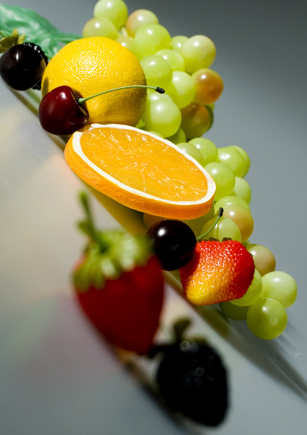
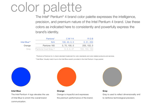
Refreshing and Tasty Design Inspiration

Art is a fruit that grows in man, like a fruit on a plant, or a child in its mother’s womb.
Jean Arp

When in need of inspiration I always turn to nature. Curves, colors, shades, reflections, beauty; You name it, she’s got it.

Here’s a healthy dose of inspiration:

INDIVIDUALISM POSTER by fatihtokoz

Rebuild the Aesthetic Poster by gomedia

poster by solo designer-d32lw4j

Killer Grapes Poster by GraphZ

Tropical by Creatunco

Print Infographics by Rhysbol

Fruit by sweetchantal1989

FRUIT RAIN by illugraphy

cherry stick heart-shape by dkraner

updated fruit poster by sweetmisery11

Becoming Reality vII


Quick Fun Fruit Facts:

  • Avocados are commonly used as vegetables. Botanically they are fruits.
  • Very few fruits contain fat: avocados, olives and nuts are the only ones with significant amounts.
  • Cranberries, Concord Grapes and Blueberries are the only major fruits native to North America.
  • Strawberries, bananas, grapes, apples and oranges are Americans favorite fruits in that order (2008).
  • The Red Delicious is the most widely grown variety of apple in the world.
  • There are 3,236  people in the U.S. listed on whitepages.com with the last name ‘Orange’
    (Mark Morton, ‘Gastronomica’, Fall 2010)
  • Grapes are about 80 percent water.


Is there something in nature that you find inspirational to your design?

The Need to Bleed


Bleeds and crop marks business cards
I recently asked my production manager and the graphic department manager here at Marsid M&M:

– What is the most common mistake that you find in artwork submitted by customers?
Answer: Missing Bleeds.

They also added that it is one of the biggest causes of delays in the customer receiving their order. It’s a fact that many businesses hire outside designers and when we contact the customer about the missing bleeds, it can take a matter of minutes to a matter of days to get the adjustments made by their designers.

Unfortunately our graphic department cannot always add the bleed because the file is not editable which is a whole other blog post (coming soon).
If we can add the bleed ourselves, we do it free of charge as a courtesy to our customers.

Bleed and Crop Marks

What is Bleed?

Some designs contain graphics or solid backgrounds that reach the edge of the paper as shown above. Printers require an additional stretch of these graphics or solid backgrounds, usually about 1/8th of an inch called a “Bleed” in order to guarantee the edges are not left without ink when the paper is cut.

Stack of paper showing bleed being cut

Quick tutorials: Adding bleed to your artwork

The easiest thing to do to prevent forgetting to add bleed is to simply make a bleed guide as the first thing you do when beginning a new design. Some professional design software makes this incredibly easy to do, some you have to do manually (still pretty easy).

Adobe Illustrator LogoAdobe Illustrator:

Illustrator offers one of the easiest and most convenient ways of adding bleeds to your documents from the start. In the “New Document” dialogue, under “Bleed” enter 0.125 in to any of the columns. If the link chain is selected already, then it will populate all 4 fields with 0.125 in automatically.

Add bleeds to an Adobe Illustrator Document


As you can see below, your bleed lines are added automatically. Shown as a red frame around the artbox…

Adobe Illustrator Bleeds


Adobe InDesign LogoAdobe InDesign:

In the “New Document” dialogue, make sure the “more options” button is pressed and at the bottom has a “Bleed and Slug” section. In the bleed box type 0.125 in and if the the link chain is selected it will automatically add it to the other 3 boxes.

Adding Bleeds in Adobe InDesign

Similar to Illustrator, InDesign automatically adds the red frame around the artbox as a guide for bleeds…

Adobe InDesign Bleeds

Adobe Photoshop LogoAdobe Photoshop:

In the “New” dialogue window, add 0.25 to the desired finish size. For example, if your designing a postcard that has a finish size of 5 x 7, then you would enter 5.25 x 7.25.

Add Bleed to Photoshop

Once you click OK, your empty canvas will appear and we will use the Rulers (View>Rulers) to use as guides to center our 5 x 7 within the 5.25 x 7.25 canvas and therefore make the bleed areas visible. Pull a guide from the ruler for each side of the canvas and drag it until it is 1/8th” inside the canvas from the edge.

Adding Bleed Guides in Photoshop

Photoshop Note:

We do not suggest using Photoshop for layout and typesetting of print projects. For best results use Photoshop for image manipulation and special effects. Import or place the image or object in Illustrator or InDesign for layout and typesetting.

Photoshop is a raster design program which uses grids of pixels to compose an object. Illustrator and InDesign create vector art which is composed of lines and curves or “Paths” to create objects and therefore create sharp edges and lines for both objects and text. Vector can also be scaled to extremely large sizes without losing quality.

Bookmark Worthy: Print-Ready Design Checklist

Use the checklist to double check that every requirement is already in your artwork to avoid any issues or delays!

Colorful Collection of Poster Designs for Inspiration

Poster by CPX InteractiveWhen promoting a band, a new product, service or simply to convey information, a full color poster will STAND OUT like capital letters in any text message.

Posters are designed to be hung on walls and many other large flat surfaces. Their large format allow for both text and images to promote events, use as an informational guide and can even be educational.

Posters can be printed on many different substrates.  To name a few: vinyl for durability, art canvas to give it an “artsy” finish or even acetate for more creative works. Posters can even be mounted on different materials or framed. Foamcore and Gatorboard are frequently used and allow for the poster to stand on its own or be displayed on an easel.

Here is a collection of beautiful and colorful posters that will hopefully strike a spark in your brain and ignite a creative fire that will make your next poster design STAND OUT beyond it’s size…

Poster by Beaucoupzero

Poster by Ellyezer

Poster by Etrix

K-Salaam and Beatnick Poster

Poster by MrHahn98

Bauhaus Poster by DT1087

Poster by StrongstuffPoster by Aremanvin

Poster by Zivrezcara

Poster by C345

BLACKOUT_POSTER_by_Demen1

[box title=”Word To The Wise” color=”#333333″]Get Inspired, Design Something Amazing and Have it Professionally Printed. Call us 516-334-1603[/box]

Amazing CMYK Inspired Designs


Printers and print designers eat, breathe and sweat CMYK.
One of the most common mistakes made when beginning a print design is to make sure the Mode is set to CMYK.

What better way to embed CMYK mode into your brain to make sure your design is correctly formatted for printing?

A showcase of Incredible Full Color CMYK Posters for reference and inspiration!

CMYK by BlackTSpawN

CMYK by DecadentBlend.com

CMYK by Shanthora

CMYK by Nellmckellar

CMYK by Seba300

CMYK Splatter

Have you had any beginner mistakes or simple “I can’t believe I did that!” mishaps in a design that you would like to share?

Share your must-see CMYK inspired designs too…

Color Consistency – Pantone Matching System

Pantone Matching System PMS SwatchIn this article I would like to talk about the Pantone Matching System (PMS) and its various uses. For those of you who are not familiar with the CMYK and PMS color processes, please visit our infocenter pages to learn more about the Pantone Matching System (PMS) or our page on CMYK and color separation.

Coca-Cola Logo using PMS
Coca Cola®

Pantone Colors and Branding

Now, just about everyone in the world is familiar with Coca-cola print ads and the use of the color red in its branding. What most people might not realize is that the red is a specific color “tint” that is used consistently throughout Coca-Cola’s advertising, a variation between PMS 484 and 485 although no specific Pantone color is specified (CMYK values can vary as well). This “Coke Red” color is claimed as “a feature of the mark” as written in Coke’s trademark with the USPTO.

In some cases, differences between a logo’s use of color or symbols (including type) as it applies to their memorability do exist and can lead to a hefty discussion. In my opinion and in this case, Coca-cola has made great use of both color and symbol (type) to leverage “Brand Stickiness”.

Pantone Matching System Color Schemes

Color and Purpose

Establishing a color scheme before starting a print project is key to providing the client with the most effective design possible. A logo for example, should be easily printable in either color or black ink only. Budgets and the purpose of the print can vary and will affect how the logo will be printed. When printing an NCR Form, the difference in price between full color (CMYK), PMS colors or black ink only can be quite significant. Most NCR forms are used for record keeping such as receipts, not as a marketing piece. Therefore, having a full color logo printed on an NCR Form might just be a waste of money that could in turn be used for marketing! On the other hand, having a CMYK version of your logo will come in very handy when printing full color brochures or full color postcards. Some clients might have a strict branding plan that demands the use of say a 2 PMS color logo to be printed with a full color brochure which basically renders a costly 6 color job. But hey, some budgets allow for that and as a designer or print buyer, it is your duty to consider these possibilities when establishing a brand.

Pantone Matching System PMS Illustrator Swatch Panel

Converting PMS colors to CMYK in Adobe Illustrator®

Using a Pantone Matching System Conversion Swatch is quite easy. As is using the Adobe Illustrator® swatch panel.

In Adobe Illustrator®, Pantone (PMS) colors are recognizable in the swatches panel by a white triangle in the bottom right corner which also has a black dot in the center.

– In your swatches panel, double click the PMS color and you will find that a dialogue box pops up titled “Swatch Options”.

– To change or view the corresponding CMYK values, simply click on the drop down menu labeled “Color Mode”, select CMYK and the value will be shown.

-Last but not least, click on the “Color Type” dropdown and select “Process Color”. Click the OK button. You will notice that the black dot in your swatch panel has disappeared and only the white triangle remains.

This small but significant Illustrator® function can come in very handy for designers when a PMS swatch is not available.

Have you ever had a customer supply you with artwork in PMS format to be used in a CMYK print project?

Please share your advice on how you would convert the PMS colors into CMYK value by commenting below.