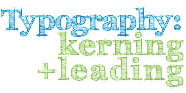
Typography – Choosing Appropriate Fonts

Typography: appropriate typefaces - choosing the appropriate font


The Timbre of Fonts

tim·bre/tambər/

Noun: The character or quality of a musical sound or voice as distinct from its pitch and intensity.

Comic Sans Office Note

Choosing an appropriate font for a design is very important.  Like sounds, I believe that fonts have timbre.  They can be described as having intangible properties that normally wouldn’t be associated with type such as being dark, violent, happy, sad, rugged or loud.  With that in mind, a design will benefit by choosing fonts which possess the appropriate timbre or tone and will help set the mood the overall design is meant to convey.

The First Step to Choosing the Right Font

Once the idea is established, a designer will need to understand how that idea needs to be conveyed.  A few points will have to be established in order to  do this:

  • Who is the target audience?
  • What is the idea?
  • Where will the design be?

These are just a few of the questions, but much will need to be determined.  Sticking with the standard who, what, when, where and why will be the simplest way to deduce the how.

Excellent Font Inspiration – Movie Posters

One of the best examples of both appropriate and inappropriate typefaces would be movie posters.  Movie posters need to grab attention and convey the timbre and idea of the movie very quickly. The posters will also have to be aesthetically pleasing at the same time. Since the movie itself already is the idea that needs to be conveyed, the imagery and timbre are already set.  The layout and fonts are what need to be established.  The design just has to focus around has already been established.

The “Cloverfield” poster has fonts that are similar to one you would find in a case report.  It supports the idea that there is a mystery or something can be classified.  The colors and blur on the text make it foreboding and also give the idea that this is science fiction and could be frightening.  After we switch the font to Comic Sans,  it turns into the box for a breakfast cereal; presumably one that is full of mystery.

Cloverfield Poster with Comic Sans


I picked two other posters that I felt had appropriate font choice and design. The “Australia” poster has a turn of the century feeling to it.  The colors give off a very rustic feeling and communicates the idea of being outdoors and limited to technology.  The font itself expresses some sort of entertainment or adventure.  It is the type of font you would have found on an old show poster or travel poster.  This typography brings you to the outback or the wild west and prepares you for adventure.
The “Transformers” Poster’s typography is sharp and looks like cut metal. The font is strong and bold.  The combination of the colors and font give it a serious timbre and express action. The typography tells you “Hey, we got robots.” without actually saying it.

Australia and Transformers Movie Poster Fonts

Typeface Lost and Found

Understanding the project and a clear statement is what is needed in choosing the correct typeface. Once determined, the designer will be able to feel what would be right. The typeface is chosen before the search begins.

Do your designs match your Fonts or do your Fonts match your designs?


Please leave your comments below…

Typography: Appropriate Typefaces – Serif vs. Sans-Serif

Typography Appropriate Typefaces - Serif and Sans-Serif

When working with typography, it is necessary to implement the most appropriate typefaces in order to correctly convey an idea.  The wrong typeface can create the wrong mood and mistake the purpose of the design.  In the most extreme case, the wrong typeface can even ruin the design. That being said, there are quite a few factors that need to be considered before deciding which typefaces to use. When deciding which typeface is needed to properly accentuate a design, one must properly categorize and then use process of elimination. The two largest classifications of typefaces would be serif and sans-serif fonts.

Serif Font Typography

A Little Bit of Serif History

Serifs are decorative accents on the end of strokes that make up each character. Serif fonts found their origin with the brush strokes used for creating early typefaces and eventually became standard.
Below is an example outlining the two defining characteristics of serif fonts: the decorative accents and the changes from thick to thin strokes throughout the individual characters.

Serifs are Decorative accents in Typefaces

Serifs: Good for the Eyes

Serif fonts can sometimes be referred to as Roman fonts because the Roman Engravings and writings often have serifs. Serif fonts are more common in print and smaller sizes.  The serifs are easily read and have been the standard for editorial copy. Serif fonts also are good for creating decorative designs or designs that need an older or more regal feel.

Sans-Serif Fonts are Easy to Read on Screen

The Sans-Serif fonts have better readability on screen.  Serif fonts have thick and thin strokes that can display unevenly on the screen causing parts that seem disproportionate and the readability in turn becomes impaired. Sans-serifs were traditionally used for accentuating type that needed to stand out because the strokes on sans-serifs are even while serif fonts have the thick and thin variation.  Sans-serif fonts have had many names through their existence.  The most common that still can be seen in some font names are “Gothic” and “Grotesque”.

Helvetica is a very popular Sans-Serif Font

Choosing between a serif and sans-serif is an important decision, but also is usually a simple one.  If the designer knows how they want to convey an idea and where it will be displayed, they have already decided if the font should be a serif or sans-serif.

After reading this article you are going to be very conscious of your choice to use serif or sans serif today, which will you be using?