
– Vision gives us the ability to see color, but how many of us can truly explain or describe what color is or where it comes from?
This quick guide gives you a brief understanding of color, how it works, its application and how it affects your design and printing outcome.
Q. What is the definition of a color?
A. Color is the sensation produced in response to selective absorption of wavelengths from visible light. It possesses the attributes of Brightness, Colorfulness and Hue. – www.Color.org
 Light is emitted by a source such as the Sun or a light bulb. Only the colors that cannot be absorbed by an object are reflected. When the light is reflected into our eyes by the object, color is the result of receptors in the eye reacting to the specific wavelength of light.
So basically, the surface properties of the object actually reflect the colors that it does not absorb. The object itself does not emit the color.
Color Application
 Color plays an extremely big roll in design. For those not already aware, color is a tool that goes beyond aesthetics and delves into the subconscious; besides our visual response, we also have an emotional response to color.
If you have a black muscle car that has 550hp under the hood and one day you decide to paint the whole thing purple, do you think the perception of the car – even though it still pushes 550hp – will remain the same? Would the viewer be more interested in the color of the car than the seconds it takes to get down the quarter-mile? With color you can control perception.
Our emotions also change the perception of an object based on its color. Our age, experiences with certain colors and other triggers all affect the perception of a color at the time of viewing.
Color Communication
 Color is defined by various properties and for the sake of communication, it has been given a name or number. Pink is a variation of red but it is distinctively a color in itself so a name was given to it. But how do we communicate the darkness or lightness of that pink? So can a yellow be referred to as Lemon Yellow or Canary Yellow, but to replicate it there must be a standard.
A system for coding color hues was developed in the 1900’s although today we have standards such as the Pantone Matching System® (PMS) which is widely used in the print and design industry and is the default matching system for popular graphic design software like Adobe® Photoshop, Illustrator and InDesign. With Pantone, a designer can designate a specific PMS color in his artwork and the printer all the way on the other side of the world can replicate the color exactly as the designer expected it to be via a Pantone swatch.
Color Vocabulary
 Here you can find the definition of the most important properties of color. These will help you manipulate color and communicate efficiently.
Hue: a gradation or variety of a color. – dictionary.com
Chroma: the purity of a hue at its furthest from gray.
Saturation: the purity of a hue at is furthest from white.
Intensity: the strength or sharpness of a hue
Luminance: the amount of light reflected by the hue
Shade: a hue created by adding black
Tint: a hue created by adding white
Color Models
Color output is affected by the media it is applied to or displayed through. For web and print purposes I will only mention the Additive and Subtractive color models.
 Additive: The colors that you see now on your monitor are created by adding white (light) to black. As more color is added to the black screen, the closer it is to white. Red, Green and Blue (RGB) are the additive primary colors and combined together produce 100% white. The RGB model is used for web graphics.
 Subtractive: This color model is typically used for printing. By applying ink, the amount of white from the paper is reduced or subtracted. Cyan, Magenta and Yellow are the subtractive color primaries. Combining these three colors produces a muddy brownish black. To achieve a better blacks and to save ink, black (K) was added to the mix. The CMYK model is used for print.
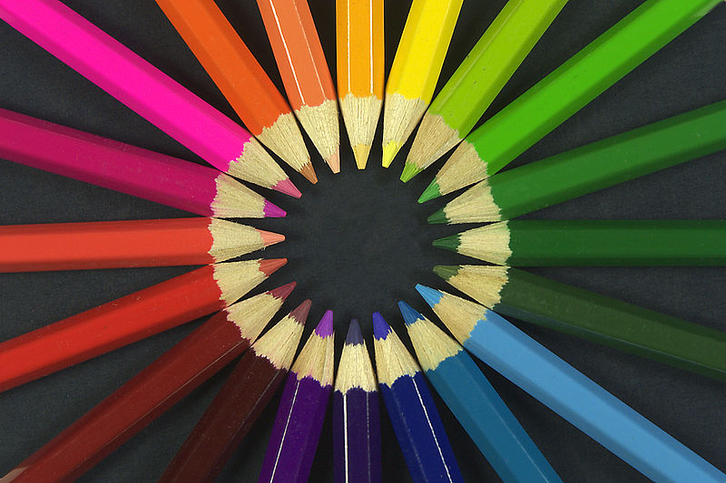
Color Types
 A color wheel is used to show the relationship between Primary, Secondary, Tertiary and Complementary colors.
Primary Colors are pure colors that cannot be made by mixing any combination of colors. The are in their purest form.
Secondary Colors are created by combining two primary colors.
Tertiary Colors are made by mixing primary and secondary colors.
Complementary Colors are those positioned directly across from each other in the color wheel.
Using a color wheel can clean up your color choices specially when using complementary colors. These are basically colors that complement each other and go well together. Many designs have beautiful structure but the chosen color combinations crash and take away from its beauty.
Both web and print designs can benefit greatly from understanding color and using a color wheel. Subscribe to our RSS feed or follow us on Twitter to stay tuned for the next post about Color and the Subconscious.
How would you explain color to someone who cannot see color?
2 Comments
[BLOCKED BY STBV] Boje, kako funkcioniraju, kako se slažu jedna s drugom? - mustra-designs.com
November 4, 2012[…] Pročitajte cijeli članak. This is footer […]
Tweets that mention A Colorful Guide to Understanding Color | Marsid M&M Group Blog -- Topsy.com
January 21, 2011[…] This post was mentioned on Twitter by JoanIzzo, Cliff Krauter. Cliff Krauter said: New Blog Post: A Colorful Guide to Understanding Color http://bit.ly/dGDbBm […]