These three trends are taking off in the new decade.
Welcome to the new decade! A new year always inspires us to think about our goals and opportunities. And, a new decade? Well, that’s an even better reason to imagine the possibilities ahead of us.
These three trends in printing all represent opportunities to set your business apart from the competition. Let each of these inspire you as you plan new projects and campaigns in 2020 and beyond.
Personalization
Expectations for personalization are rising from consumers. Businesses must demonstrate that they understand their customers and tailor their offerings appropriately. Consumers are being presented with so many digital messages and services today. It can be overwhelming to keep up.
One of the best ways to help you stand-out among the constant barrage of digital advertising is to use print. Relevance is key to success here. Consider using postcards to distinctly highlight your products and services. With a striking design, they will catch the eye in a stack of mail and generate the leads you’re looking for.
Even better, is to personalize your message and tailor the direct mail specifically based on a particular market segment. Instead of sending just one postcard for all potential customers, consider creating 2 or 3. Each postcard should have message designed for relevance among that segment of your market. This will help your potential customers feel valued and understood.
Postcards are a blank slate–they can be large or small and the sky’s the limit in terms of the graphic possibilities. This tried and true method for generating leads can be as modern as you want it, especially if you utilize the design trends that we highlight below.
In 2020, you can spark interest and bring new business to the table by utilizing personalized direct mail. M&M is here to help you take advantage of this trend through the full process including design, printing, and mailing.
Pantone’s Color of the Year: Classic Blue
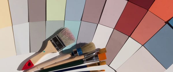
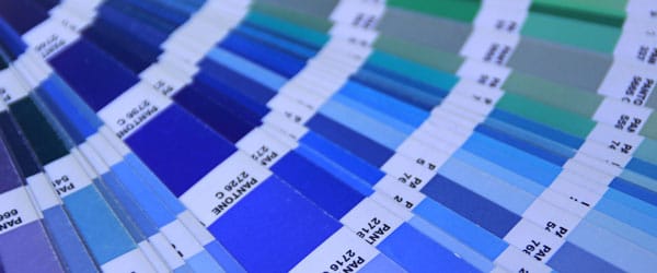
Color is a fundamental component of most print projects. It’s important to think about how the colors you choose aligns to your brand, your message, and the goals of your project.
You can expect to see a lot of Pantone’s color of the year, Classic Blue (19-4052) in 2020. It’s a gorgeous deep blue shade that’s harkens serenity and confidence. Imagine the sky, right as dusk is shifting to night. This calm and confident blue is very elegant and works for a variety of brand styles.
Pantone began their color of the year tradition over 20 years ago in 1999 when it chose Cerulean, another serene shade to usher in the start of a new millennium. While quite a lot has changed in the world over the last 20 years, Classic Blue remains timeless.
Leatrice Eiseman, Executive Director of the Pantone Color Institute, described Classic Blue as “A boundless blue evocative of the vast and infinite evening sky, Classic Blue encourages us to look beyond the obvious to expand our thinking; challenging us to think more deeply, increase our perspective and open the flow of communication.”
We expect to see Classic Blue in print, displays, and promotional products this year. Consider using Classic Blue this year to as an accent color on your next project. It compliments everything from vibrant and neon colors to neutrals.

Minimalist Design
Less is more in terms of design in 2020. Minimalist design constrains the designer to include only the most important information through the simplest visual construct. It requires discipline to eliminate extraneous clutter from a design.
We’re seeing this trend in action everywhere from booklets to business cards and everything in between. In addition to the calming aesthetic it brings, minimalist designs are often easier for audiences to consume. This is a great benefit when it comes to marketing products!
Minimalism pushes us to really get clear about our brand, our message, and our goals. There’s no room for excess when minimalist design is the goal. Exploring a minimal design can help you bring the fundamentals of your message to customers right to the forefront, with no question. It can be very powerful.
Some tips to consider when aiming for a minimalist design on your next project include:
- Identify and Cut the Excess
This may sound obvious, but it’s one of the hardest things to do when designing a new project. Ask yourself whether each element in your project is absolutely necessary. If the answer is no, out it goes!
- Include Plenty of Whitespace
The one area of abundance in a great minimalist design is whitespace. Whitespace doesn’t always have to be white. We consider whitespace to be any spaces between content. Make sure your content has room to breathe and you’ll be well on your path to a minimalist design.
- Choose a Simple Color Palette.
Using one or two bold colors can stand out more than using 5 or 7 colors in a design. Whether you choose a monochromatic palette or one with a handful of complementary colors, try to restrain the number of colors in your palette. Don’t be afraid to stick with the essentials.
And, there you have it–the top three design trends in printing for 2020. No matter what’s trending, the most important and timeless aspect of any successful project is to create something you’re proud of that helps you achieve your goals. At the Marsid M&M Group, we’re always here to help you do just that.
Following other trends in your market space that we should know about? Let us know in the comments below.
Leave a Reply