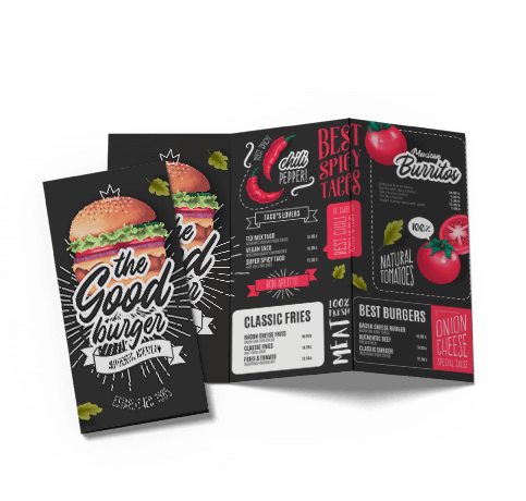
Welcome to Our Printing Info Center

This entire section of our web site is being designed so you can learn about the printing process and how your orders are produced from start to finish. Use this section as source of reference, if you have any artwork issues or concerns you can always come back and learn about the many tips and tricks that we have encountered in our 34 years of experience. Articles will be updated as new advice is available.

Recent Printing Articles & Resources

  • The Importance of Printing with Pantone Colors
  • The difference between 1 color text & 4 color text
  • Using high resolution photos & images for printing
  • Font Issues - Flattening your Artwork or Send Fonts
  • CMYK and Color Separation
  • ----Downloads-----------------------------------------------
  • Download Graphic Design Templates
  • Download Our Desktop Wallpaper
  • Three Points to Remember

    Those of you who need few quick answers to the three most common printing issues please read below. We receive hundreds of files every month,now and then we will receive a file which is of low quality simply because of the way it was designed. Clear & true to color printing can only be guaranteed when file properties are accurate.

    1) Creating your artwork with bleeds - include 1/8th (.125) of an inch on every side

    Anytime you see a printed image which extends from end to end on postcards, brochures, etc, it has been created with a bleed. A bleed is basically an extension of the image which will be cut off.

    The image to the right is one of our own postcards. When printed, it is actually cut
    to a 11 x 6" size. However, the file size is really 11.250 x 6.250". The extra 1/8 inch (.125) per side, is needed so our bindery department can trim the excess and leave a clean centered
    image without a border. Be sure to create your artwork at least an 1/8 inch (.125) larger
    per side, than the actual printed size for the best quality.

    2) RGB & CMYK Color Pallet Explained - The english version

    Perhaps one of the most misunderstood truths when printing in color. The 2 acronyms above refer to the color palette which is used in graphic design. By default, most art programs will use the RGB color palette because many photos and web graphics will be using this standard palette. When setting up your files for printing however, you must convert the color pallet from RGB to CMYK as all commercial printing presses use 4 base colors referred to as CMYK printing.

    When you request printing in 4 colors, the different hues and shades of color are all derived from a combination of 4 base colors, Cyan, Magenta, Yellow & Black. Many printers will simply convert the color pallet for you before they print your order. Unfortunately, when you convert the color pallet to CMYK sometimes the color looks different than what you see on your monitor. This is the cause of all the horror stories you hear about when custom

    Important:
    Most printing companies will convert your graphics to CMYK in order to print. However if you convert your image yourself you will have a better representation of how the finished product will look.

    If you do not convert the files to CMYK yourself, you run the risk of your job looking different than expected because the conversion was not made. Supplying files in CMYK format is the responsibility of the graphic designer.

    ers complain "My brochure doesn't look the way I wanted it to". The safest way to achieve color printing accuracy is to create your artwork using the CMYK pallet from the start. Doing this will give you a better idea of how your colors will look when printed. (example below)

    3) Printing in high resolution and understanding D.P.I. - Lets be clear on this

    DPI is the measurement used within the printing and graphics design industry to determine how sharp an image is. Web graphics, online pics, etc. are normally created at 72dpi (dots per inch), this low resolution is great for the web because the images look excellent on a computer monitor and the file sizes are very small. When designing graphics for printing purposes, your images should be 300dpi or better. Essentially what this is doing is displaying more information (or dots) for every square inch of the image you are viewing. The more dots used, the sharper the image, it's really that simple. Color printing will look blurry if a 72dpi artwork is used, make sure you have your images at 300dpi before you submit your files

    Example of CMYK Color Conversion
    >CMYK Color Pallet
    Example of RGB Color Conversion
    >RGB Color Pallet
    Color Printed Postcard Showing One Eigth Inch Bleed
    Join our mailing list and receive periodic notification of our unique promotions and printing specials!
    Better Business Bureau - click to view our membership National Alliance for Printing Leadership - Member Graphic Arts Technical Foundation  - Member
    Official Microsoft Publisher Service Provider